That divergence may be one of the most important market signals today.
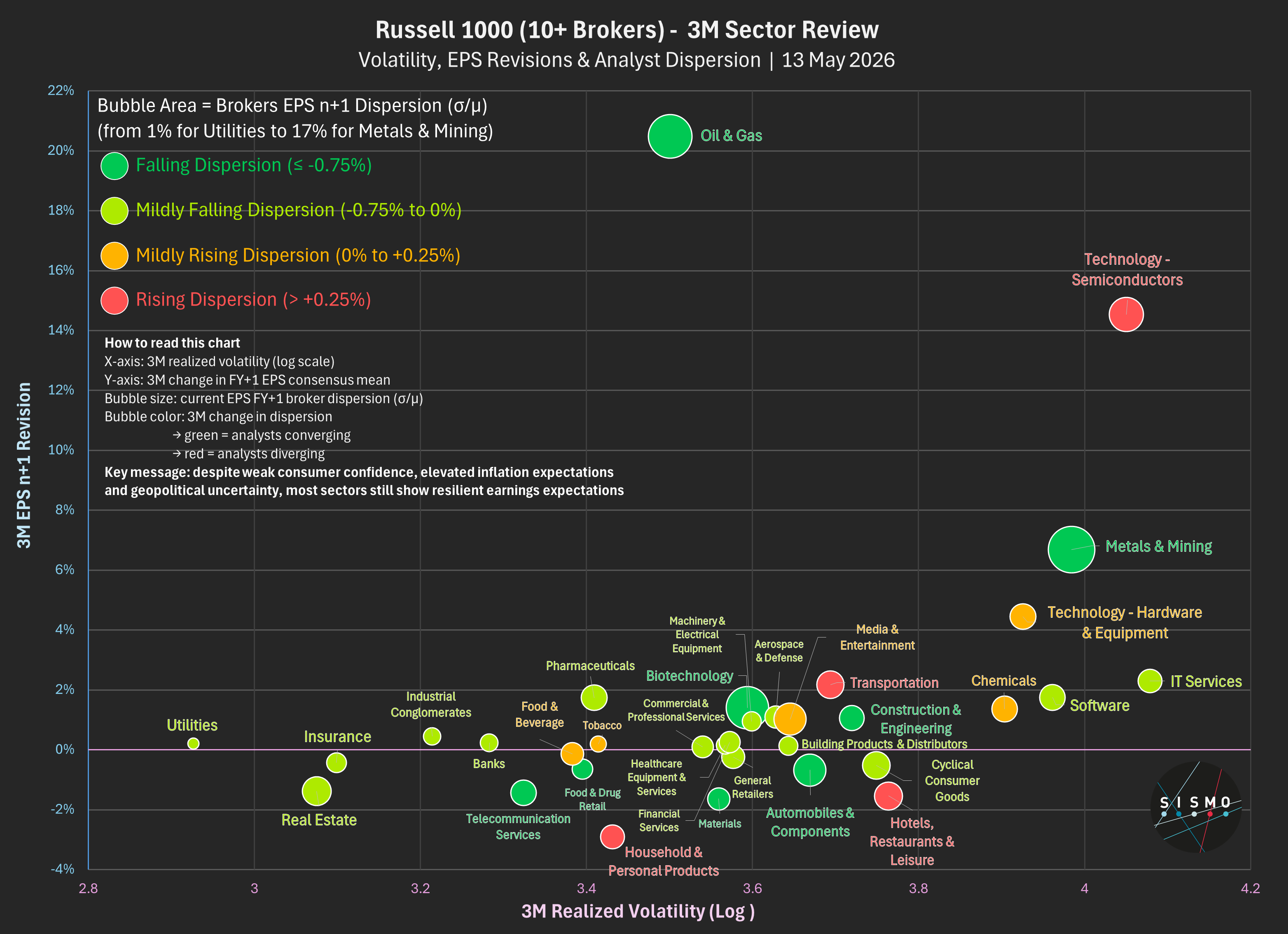
Using a Russell 1000 proxy filtered for stocks covered by at least 10 brokers (830 names across 33 Sismo sectors), we find that EPS revisions over the last 3 months remain broadly positive: the median FY+1 EPS revision across the universe stands at +0.45%.
Despite geopolitical tensions - and nearly three months after the Iran conflict began - earnings expectations are improving, not deteriorating.
The strongest upward revisions are concentrated in:
• Oil & Gas
• Semiconductors
• Metals & Mining
• Hardware Tech
But the real signal comes from analyst dispersion.
Oil & Gas shows the strongest upward EPS revision (+20.5%), combined with high current dispersion but falling disagreement over the past three months. Direction is positive and analyst conviction has improved despite geopolitical sensitivity.
Semiconductors rank second for upward EPS revisions (+14.5%). Current broker dispersion remains moderate at 9.4%, but it has increased the most over the past three months (+0.7%). Analysts remain constructive on AI-driven earnings but the range of outcomes is widening.
Metals & Mining shows a similar but more uncertain pattern: strong positive revisions (+6.7%) combined with the highest current dispersion in the universe (17.4%), reflecting broad disagreement around commodity sensitivity and geopolitical outcomes.
Software and IT Services remain highly volatile, yet analyst disagreement is limited - as if consensus already agrees these sectors face structural pressure from AI.
Most surprisingly, broker dispersion has fallen across most sectors over the past three months.
In short:
geopolitical uncertainty ↑
earnings uncertainty ↓
At the same time:
• consumer sentiment is near historic lows,
• inflation expectations remain elevated,
• gasoline prices continue to rise.
Consumers are experiencing inflation in real time.
Equity markets continue to focus on earnings resilience.
Both cannot remain true forever.
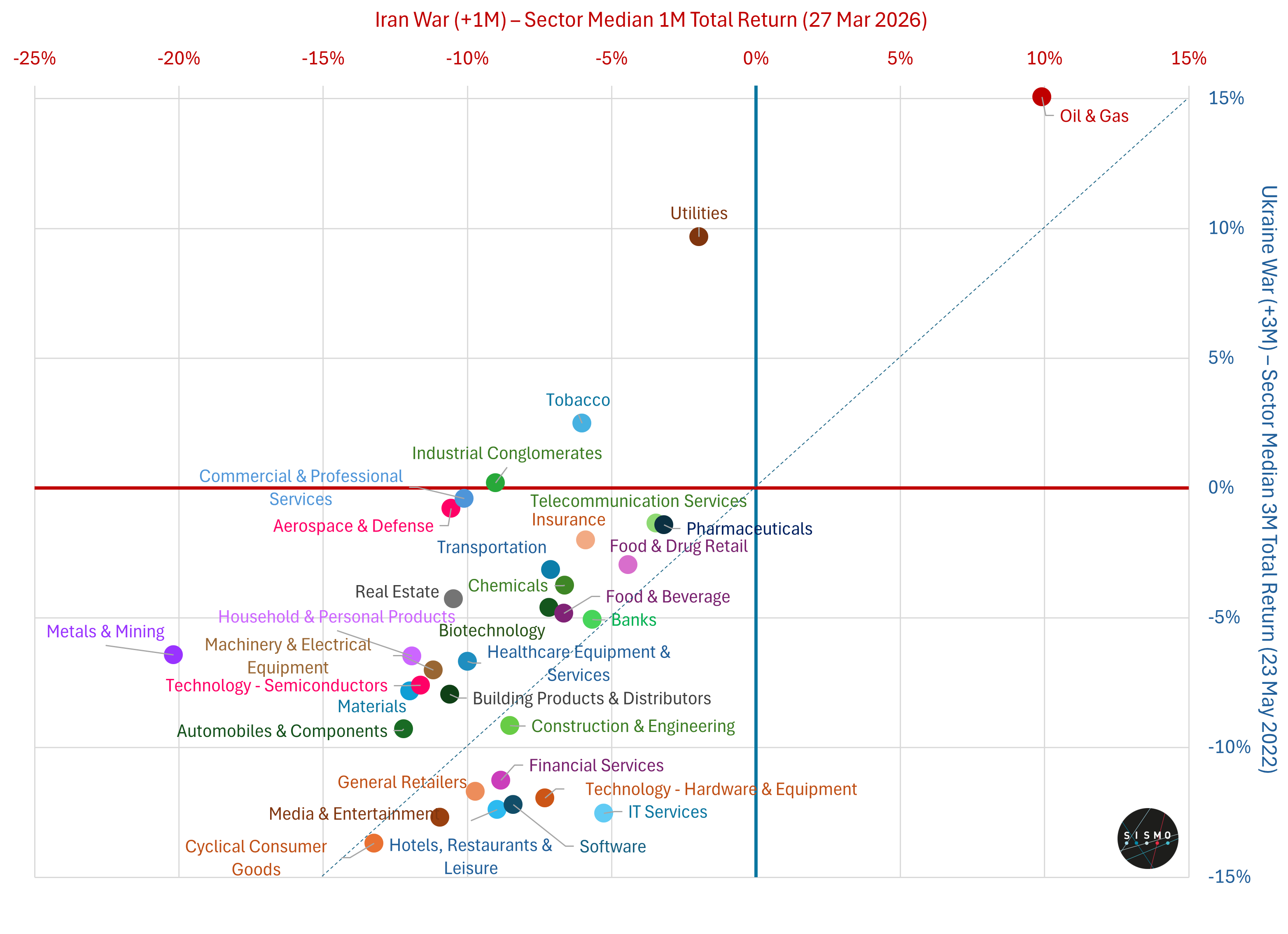
Using Sismo data (MSCI ACWI ETF proxy), comparing 1M after the Iran war (2026) vs 3M after the Ukraine war (2022):
The pattern is familiar but the magnitude and cross-sector signals are very different.
The shock is broader:
Median return is -8.25% after one month vs +0.69% (1M) and -5.73% (3M) in 2022.
The oil move is sharper:
Brent +45% in one month vs +16% over three months in 2022 - a faster, more disruptive shock.
In 2022, oil had already been rising for months (Dec 2021: $70 → $100 pre-war → $115 by May)
But the key difference is in sector behavior:
Metals & Mining -20% (vs -6%)
Utilities -2% (vs +10%)
Defense not outperforming
The data points in a different direction:
Energy is the only clear winner (+10%).
Economically sensitive sectors (Consumer, Industrials, Tech, Financials) are down between -7% and -14%.
Metals, a proxy for global industrial demand, is the worst performer.
Defensive segments are not providing upside: Utilities are negative and Defense is not outperforming.
Taken together, markets appear to be reacting not just to higher energy prices, but to the risk that rising costs and disrupted trade weigh on global activity.
Are markets already pricing a slowdown?
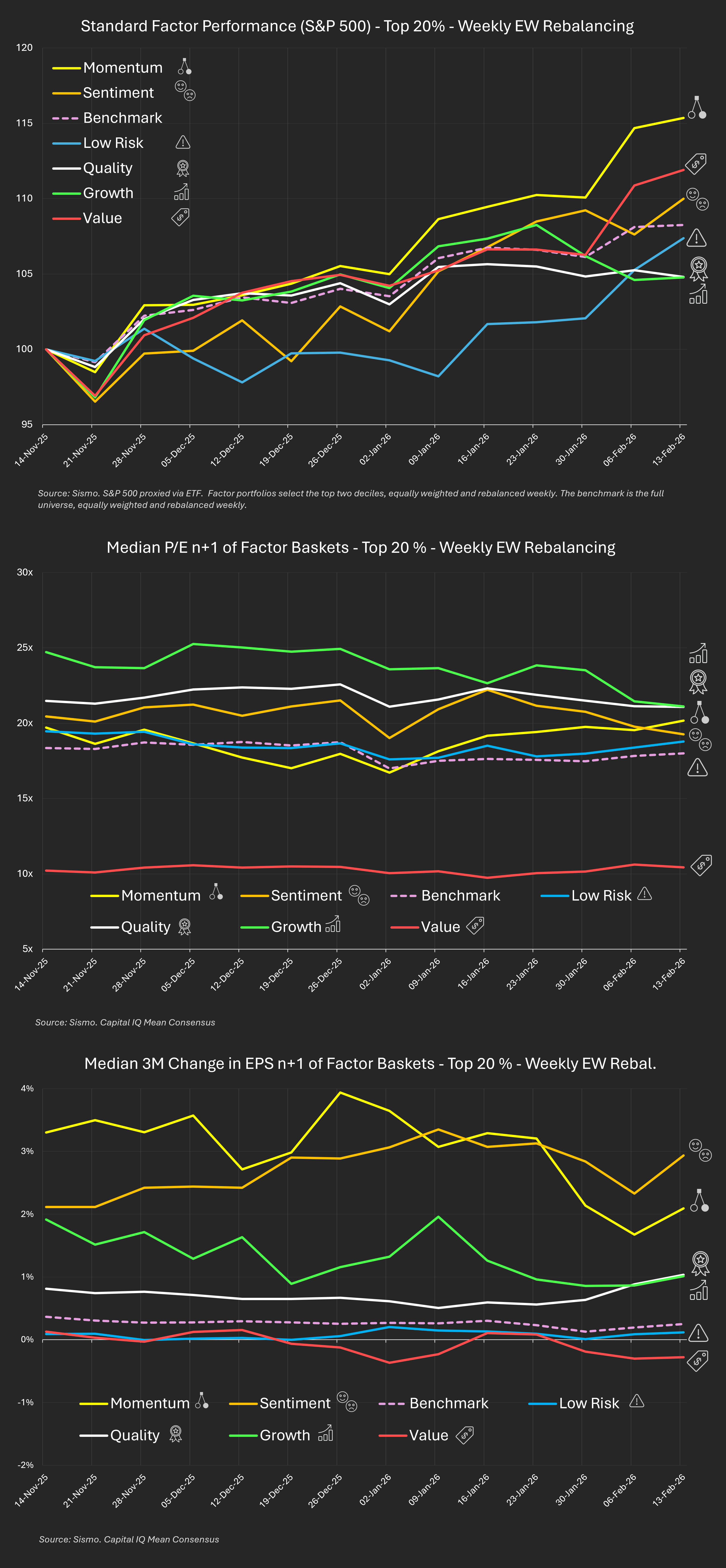
The last three months in the S&P 500 weren’t random.
The divergence across styles tells a clear story.
Using weekly rebalanced top-20% factor baskets, measured against the full equal-weight universe, here’s what happened:
Mid-Nov → Mid-Feb
Dispersion widened materially - especially from early January, during earnings season.
Returns alone don't explain much.
So we decomposed the drivers.
For each basket, weekly, we tracked:
The last three months weren’t a simple “risk-on” phase.
They reflect:
Different drivers. Same market.
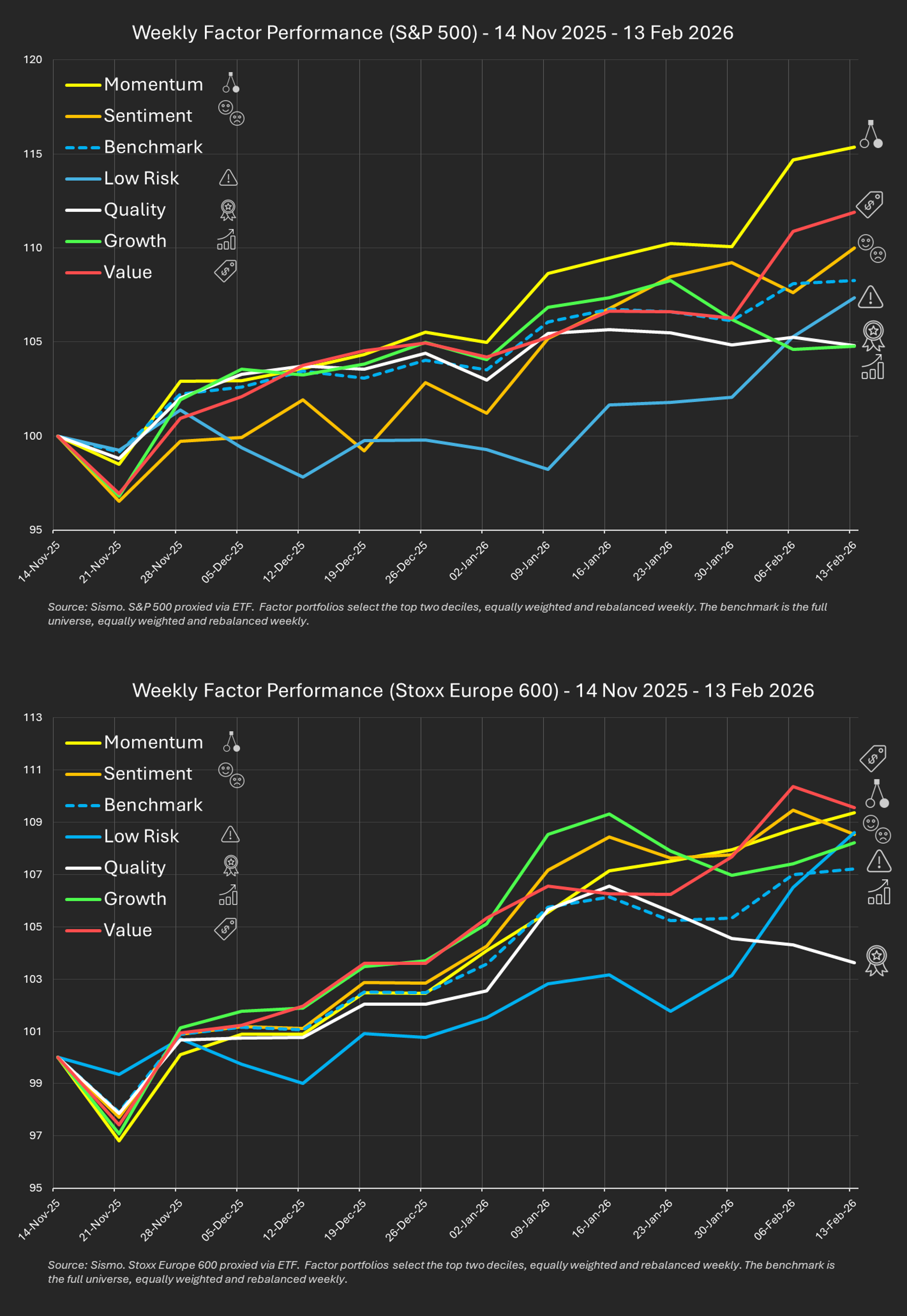
Since late December, relative factor leadership has strengthened rather than reversed.
We analysed weekly rebalanced top 20% factor baskets (equal-weighted) across:
Benchmarks are the full proxy universes themselves, also equal-weighted and weekly rebalanced.
This highlights relative performance across stocks - not index concentration effects.
Dispersion between factor leaders and laggards reached ~10 points.
The widening accelerated from early January - during earnings season.
There was no broad factor reset.
Relative trends strengthened.
Europe appears more balanced.
The US shows more concentrated leadership.
This period has been highly selective.
Certain industries - notably Software, repricing on AI-related competitive pressure - have been sharply penalised. Others have continued trending strongly.
At the factor level:
This does not look like a macro-driven regime shift.
It looks more like a reinforcement phase - where earnings season confirmed relative positioning rather than disrupting it.
.jpg)
From idea generation to portfolio decision.
You’ve done the work on the stock.
Now see what the decision really does to your portfolio.
This video illustrates how Sismo helps fundamental PMs move from conviction to execution - revealing hidden overlaps, factor and macro side-effects and restoring the desired portfolio balance without breaking the investment thesis.
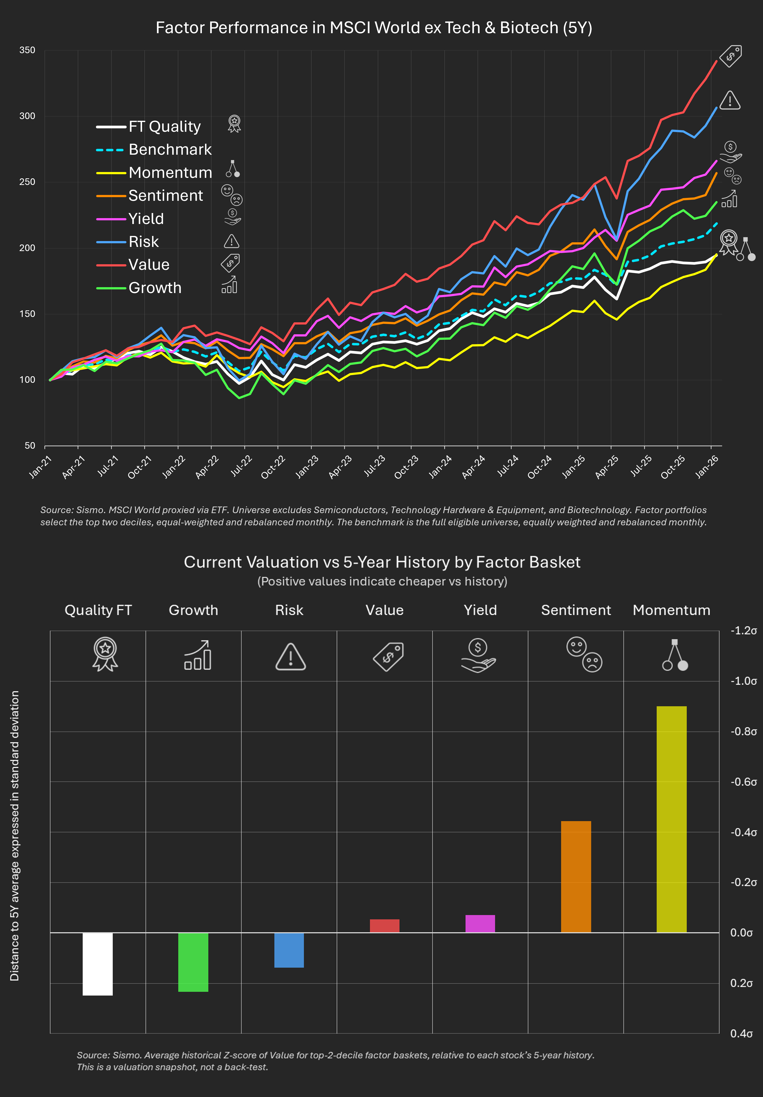
Inspired by a recent FT article by Ruchir Sharma (“The best time to buy quality stocks is now”), we tried to test a simple idea:
have high-quality stocks really been neglected?
We built a Quality FT factor combining profitability, balance-sheet discipline and earnings regularity, and applied it to MSCI World excluding semiconductors, tech hardware and biotech - away from the front line of the AI narrative.
The back-test result is straightforward (top chart): quality has lagged over the past five years.
That’s not a bug. It’s the regime.
Markets rewarded:
As a result, non-tech quality stocks saw declining relative demand and compressed valuations - not because they were bad businesses, but because they didn’t match what the market was rewarding.
Looking at valuations today (not performance), the picture changes.
Relative to their own 5-year history (bottom chart), top-two-decile factor baskets show where their current valuations stand:
This setup doesn’t rely on timing the end of any narrative.
It simply reflects a growing gap between business quality and market attention.
And that gap rarely persists forever.
An investment edge is not about more data. It’s about understanding interactions.
From factor biases to stock similarity, from sector concentration to scenario simulation — this video shows how Sismo helps investment professionals move from isolated stock analysis to coherent portfolio insight, with clarity and control.
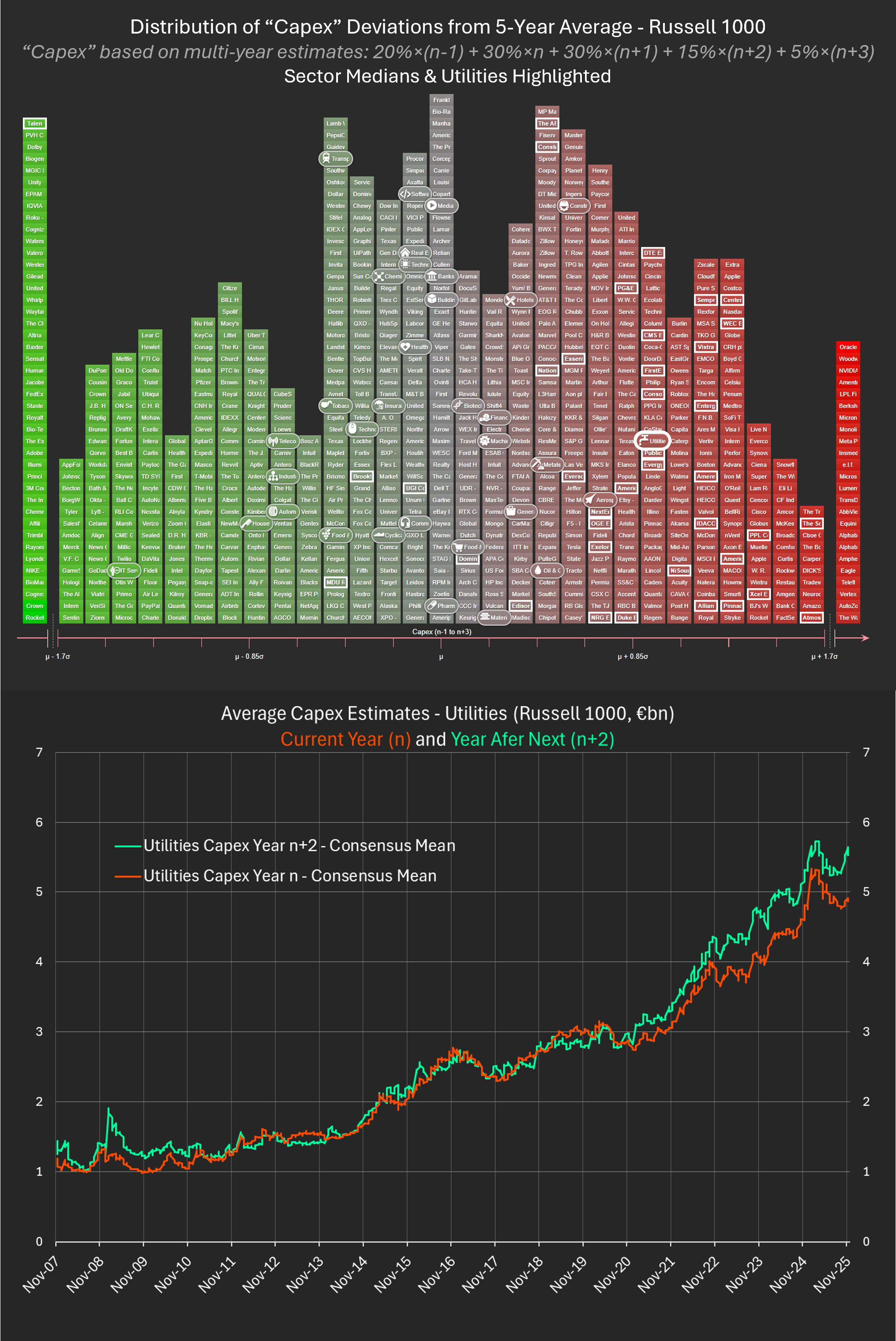
For decades, Utilities were the textbook defensive sector: regulated earnings, predictable cash flows and slow but stable investment cycles.
They were not exciting.
They were dependable.
AI is now putting that identity under pressure.
Unlike previous technology waves, AI is not just software. It is physical infrastructure: data centres, electricity grids, generation assets and new capacity built years ahead of revenue certainty.
Utilities are at the centre of this build-out.
Recent hedge-fund positioning reflects this shift. According to Goldman Sachs, Utilities are now the most shorted sector in the S&P 500 (as a percentage of market capitalisation), a sharp departure from historical norms.
The Financial Times summarised it bluntly:
“Normally boring utility stocks have begun to look a little racy.”
At Sismo, we examined this through a capital-allocation lens.
Rather than focusing on prices or valuations, we constructed a composite Capex indicator using the latest reported year and forward analyst estimates (from FY-1 through FY+3), designed to capture both near-term intensity and medium-term commitment.
We then measured each company’s current investment level versus its own five-year history using a History-Z methodology - expressing today’s capex relative to past regimes.
This removes cross-sector and size distortions and isolates true behavioural change.
The results are unambiguous.
Across the Russell 1000, Utilities display the most extreme positive deviation from historical investment norms of any sector. Median positioning stands more than 1.2 standard deviations above the five-year average - well beyond what is typically observed for stable, regulated industries.
The time series reinforces the picture.
From 2007 to 2020, utilities’ capex rose gradually.
From 2021 onward, it inflects.
From late 2022, it accelerates sharply.
Forward estimates steepen at the same time.
The inflection point coincides with the industrialisation of generative AI.
This does not imply that Utilities are mis-allocating capital.
But it does raise a fundamental investment question:
Who carries the risk if infrastructure is built faster than revenues materialise?
If AI demand unfolds as projected, Utilities may evolve into strategic growth infrastructure - no longer defensive, but essential.
If demand disappoints, pricing weakens, or energy efficiency improves faster than expected, Utilities could be left with front-loaded investment, long amortisation cycles and returns built on assumptions that no longer hold.
This is not a call on AI.
It is a call to recognise that capital risk has moved.
AI is not just transforming technology stocks.
It is reshaping balance sheets - and risk profiles - in the power system itself.
Utilities may be one of the clearest early examples of that shift.
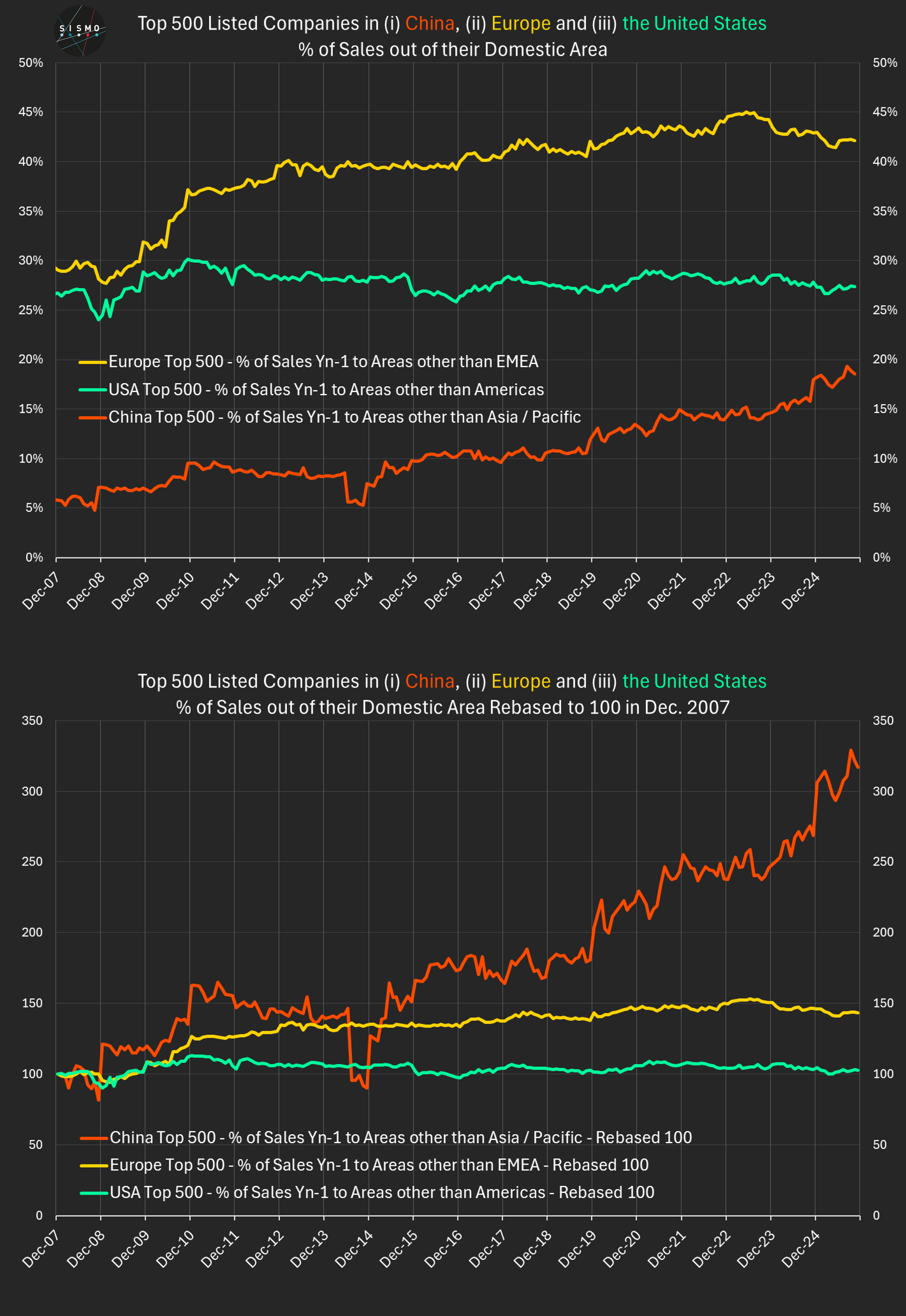
Using Sismo, we analyzed 18 years of geographic revenue data for the top 500 listed companies in China, the U.S. and Europe. Two long-term charts summarize the results:
The findings challenge several widely repeated assumptions.
1. China is not as export-dependent as often claimed
For Chinese large caps, the average share of revenues generated outside Asia/Pacific rose from ~6% to ~18% since 2007 - a three-fold increase.
China’s top companies remain the most regional of the three blocs, but the internationalization trend is clear.
2. U.S. companies are far more domestic than the global narrative suggests
For nearly 20 years, U.S. large caps have generated on average only ~25–30% of revenues outside the Americas. The indexed line is almost flat.
Despite their global visibility, most U.S. champions still earn the bulk of revenues in their home region.
3. Europe is structurally the most international of the three
European large caps generate ~42%of revenues outside EMEA today, up from ~29% in 2007.
They show both the highest international share and the strongest upward trend. This mirrors decades of corporate-strategy research showing that European firms expand abroad to offset structurally slower regional growth.
What this tells us
Across the world’s largest listed companies:
Capital flows may be global, but
➡️ corporate revenues remain overwhelmingly regional.
Methodology
To ensure consistent comparison across regions, “home markets” follow the broad geographic regions most widely used in company reporting (China → Asia/Pacific, U.S. → Americas, Europe →EMEA). The universe is dynamic: each month, we take the top 500 companies by market cap at that date, so the composition naturally evolves with market conditions. Revenues rely on company-reported geographic segmentation; no size weighting is applied.
Sismo makes this type of long-horizon geographic and factor analysis instantaneous across any universe or portfolio.
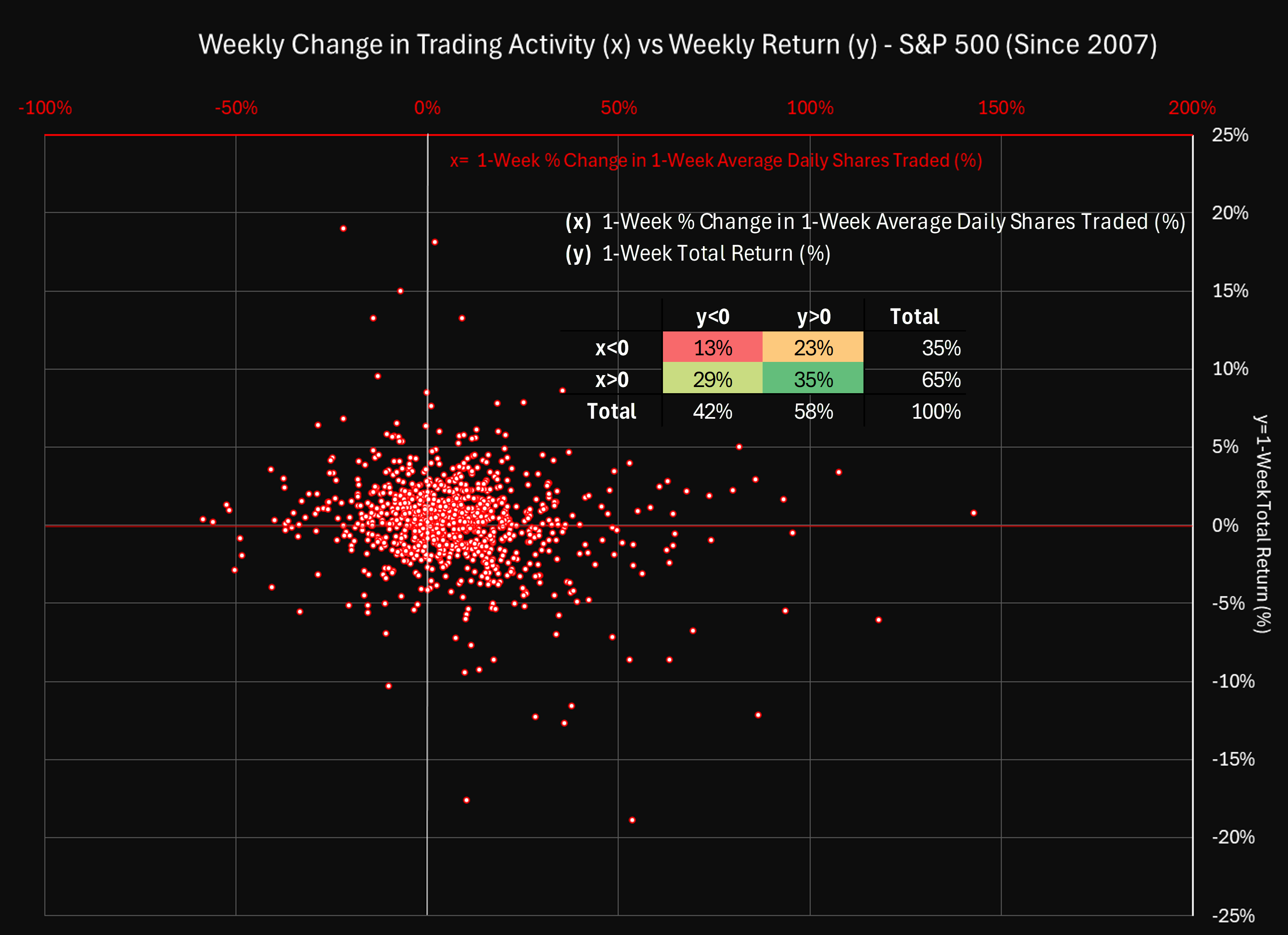
Trading Activity and Price Moves: 944 Weeks of S&P 500 History Tell a Subtler Story
Last week reminded us how subtle the link between price moves and trading activity can be.
The S&P 500 had a difficult week, especially for tech:
• Semiconductors averaged –3.3 % (Nvidia –7.1 %)
• Software averaged –3.6 % (Synopsys –13.3 %)
Yet the change in trading intensity told a different story.
Average daily shares traded fell 7 % for semiconductors (–10.8 % for Nvidia) but rose 26 % for software.
That contrast led us to revisit the long-term relationship between:
x = 1-week % change in 1-week average daily shares traded
y = 1-week total return
Using 944 weekly observations since October 2007 (S&P 500, equal-weighted cross-sectional averages), we plotted y vs x.
The scatter - with a small table inset - summarizes the entire distribution.
What stands out
• In roughly two-thirds of all weeks, x > 0: trading activity increases compared to the previous week.
Yet average volume over time is flat. The pattern is asymmetric - many small increases, offset by fewer but sharper declines.
• The sign of x doesn’t determine the sign of y.
Markets drift upward more often when activity contracts, while rising activity is associated with both rallies and drawdowns.
• Negative returns often come with rising activity.
A market decline is noticeably more likely to coincide with a rise in trading activity than with a slowdown - roughly two times out of three.
How it fits broader evidence
Academic research (Karpoff 1987; Clark 1973) has long shown that trading volume correlates with volatility, not direction.
This aligns with the “mixture-of-distributions” view: bursts of information drive both price changes and turnover.
Whether the signal is good or bad, investors act more when the market is reassessing risk.
For investors
Changes in trading activity don’t reveal a bullish or bearish bias.
They reflect engagement - moments when the market is reacting, reallocating, or repricing.
Periods of reduced activity often accompany steady gains.
Periods of rising activity mark transition or stress.
For investors, the message is clear: volume change is a context variable, not a signal.
It tells you when the market’s attention has shifted - and that’s when new information matters most.
(Analysis produced with Sismo. The chart shows y plotted against x across 944 weekly observations, with summary frequencies displayed in the inset.)
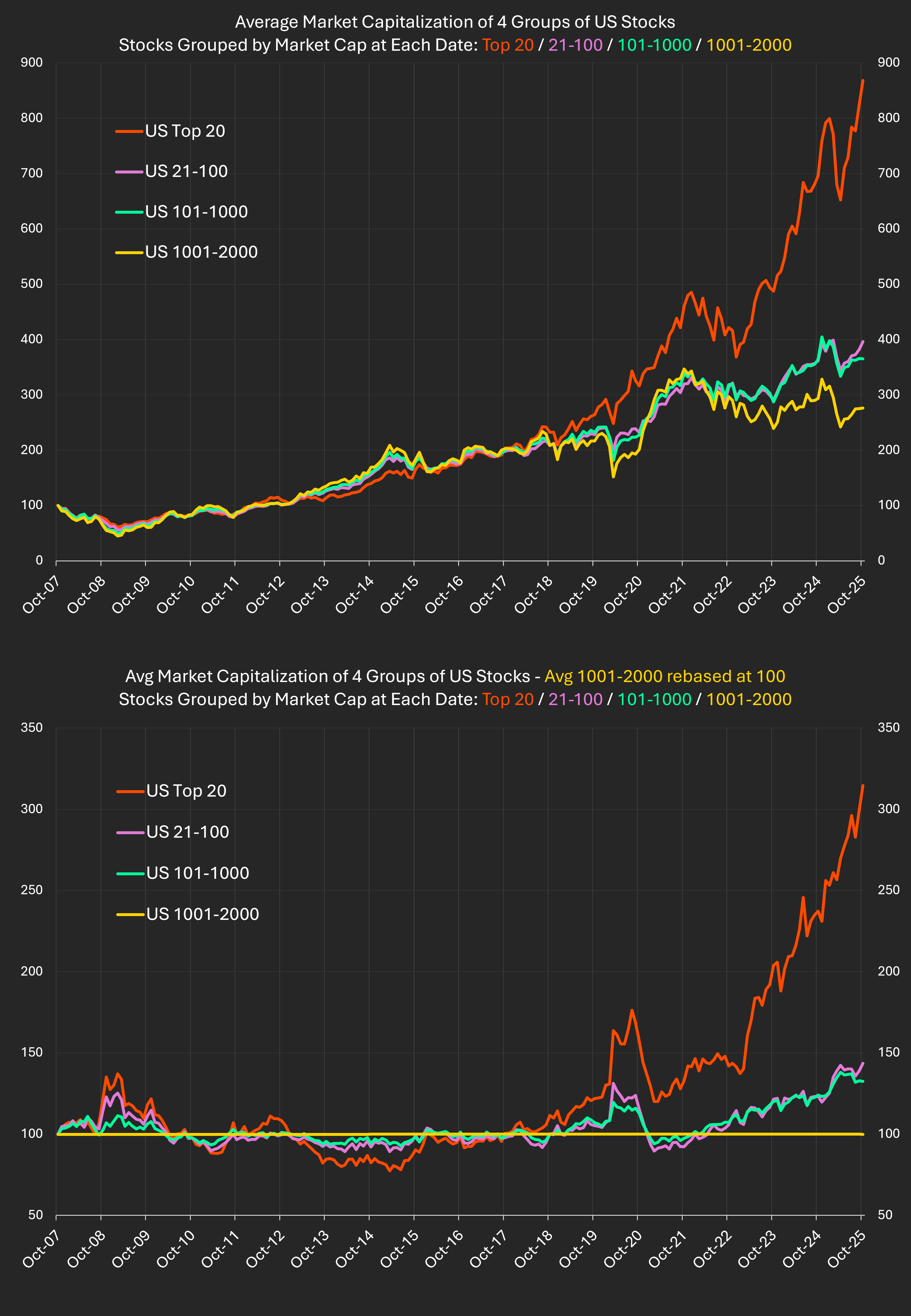
This analysis examines how U.S. equity market concentration has evolved over the past 18 years using Sismo’s dynamic universes. By ranking all listed U.S. companies by market capitalization at each date, we can observe how the average size of firms in each segment has changed and how the dominance of the largest players has intensified - particularly since the acceleration of the AI revolution in 2023.
The analysis tracks the evolution of average market capitalization across four dynamic groups of U.S. stocks between October 2007 and October 2025:
(1) ranks 1–20 (2) ranks 21–100 (3) ranks 101–1000 (4) ranks 1001–2000.
Each group is rebalanced monthly by market-cap rank and rebased to 100 in October 2007.
The top chart shows the evolution of each group’s average market capitalization.
The bottom chart shows each group’s “distance” to the 1001–2000 segment – how the gap in average market capitalization has changed relative to October 2007.
For example, today the Top-20 reads 314 in the bottom chart, meaning their average market capitalization has grown 3.14 × faster than that of the 1001–2000 segment since 2007.
The ratio of the average market capitalizations of groups 2 and 3 is almost unchanged from 2007 (+8.5 %), confirming that the concentration story is essentially a Top-20 phenomenon.
The surge in concentration forces a rethink of diversification, valuation, and portfolio risk.
Insights from Goldman Sachs’ Market Concentration: How Big a Worry? (2024) highlight several key points:
U.S. equities have risen sharply overall, but leadership has changed.
The Top-20 have accelerated far beyond the rest, while the broader market has expanded without major reshuffling below that line.
Whether this gap keeps widening or mean-reverts will shape the next decade of active management and redefine diversification itself.
Data: Sismo dynamic universes built on S&P Capital IQ global equity coverage. Analysis as of October 2025.
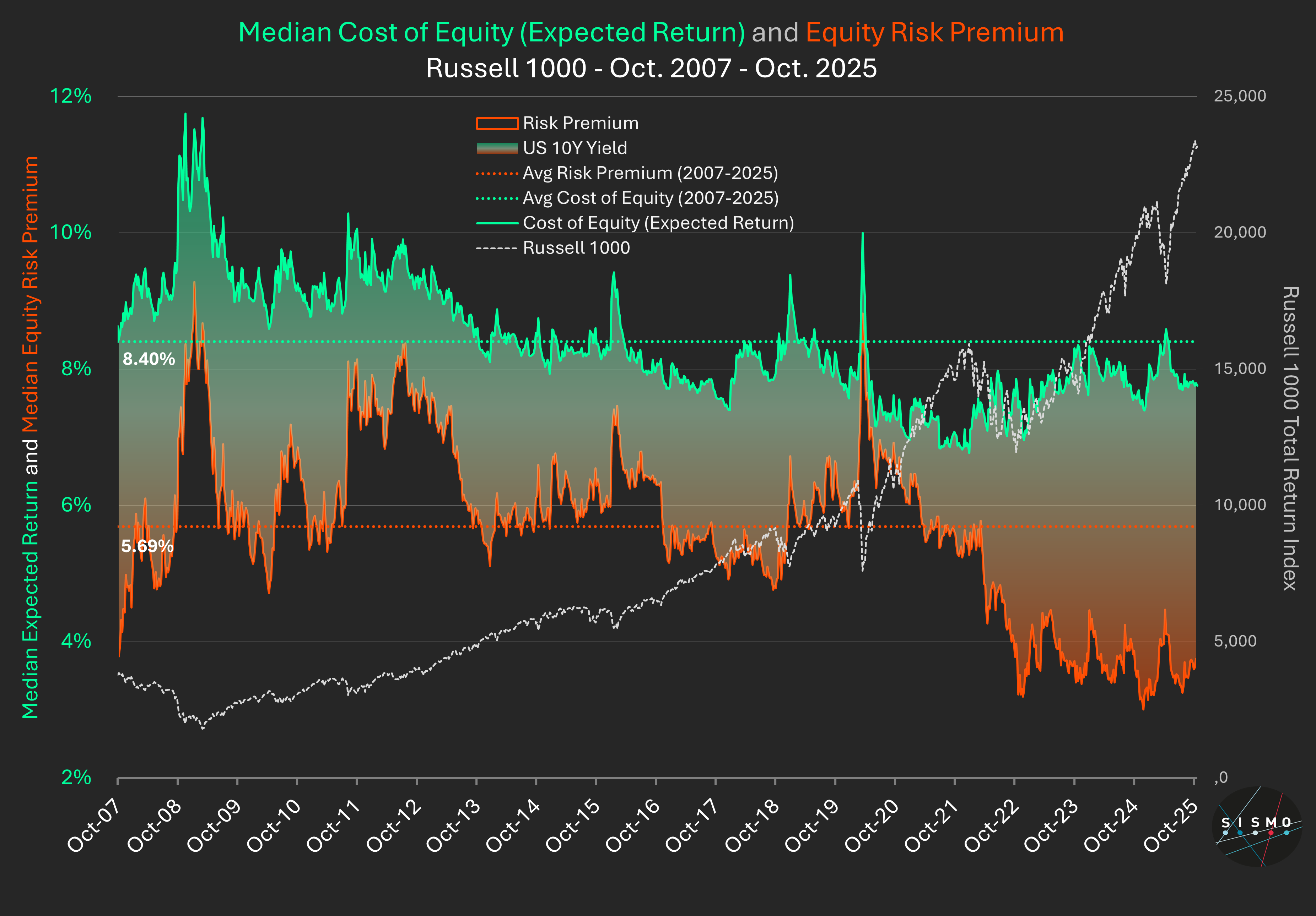
At Sismo, we’ve been tracking the median Cost of Equity for the Russell 1000 since 2007 using a proprietary model applied stock by stock.
Our Cost of Equity combines two price-anchored components:
Today’s reading
What it means
Context and research
Academic work (Fama & French 2002; Duarte & Rosa 2015; Damodaran 2023) defines the Equity Risk Premium as the market’s price of risk - the premium investors demand for holding equities over safe assets. It narrows when optimism rises or bond yields improve.
Estimating expected returns is always model-dependent. Sismo’s framework keeps parameters and data sources consistent since 2007 to ensure comparability over time.
The catch
Our model relies on rolling broker forecasts for the next three years. If these forecasts prove overly optimistic, both the earnings-yield and growth components decline - pushing implied expected returns lower and valuations higher.
Bottom line
We don’t see a bubble yet - but we do see compressed risk premiums and fragile growth assumptions. If analyst visibility holds, markets may hover. If not, gravity will do its work.
For those interested in the academic foundations and methodology behind Sismo’s Cost of Equity and Equity Risk Premium framework, feel free to contact us to explore it in depth.
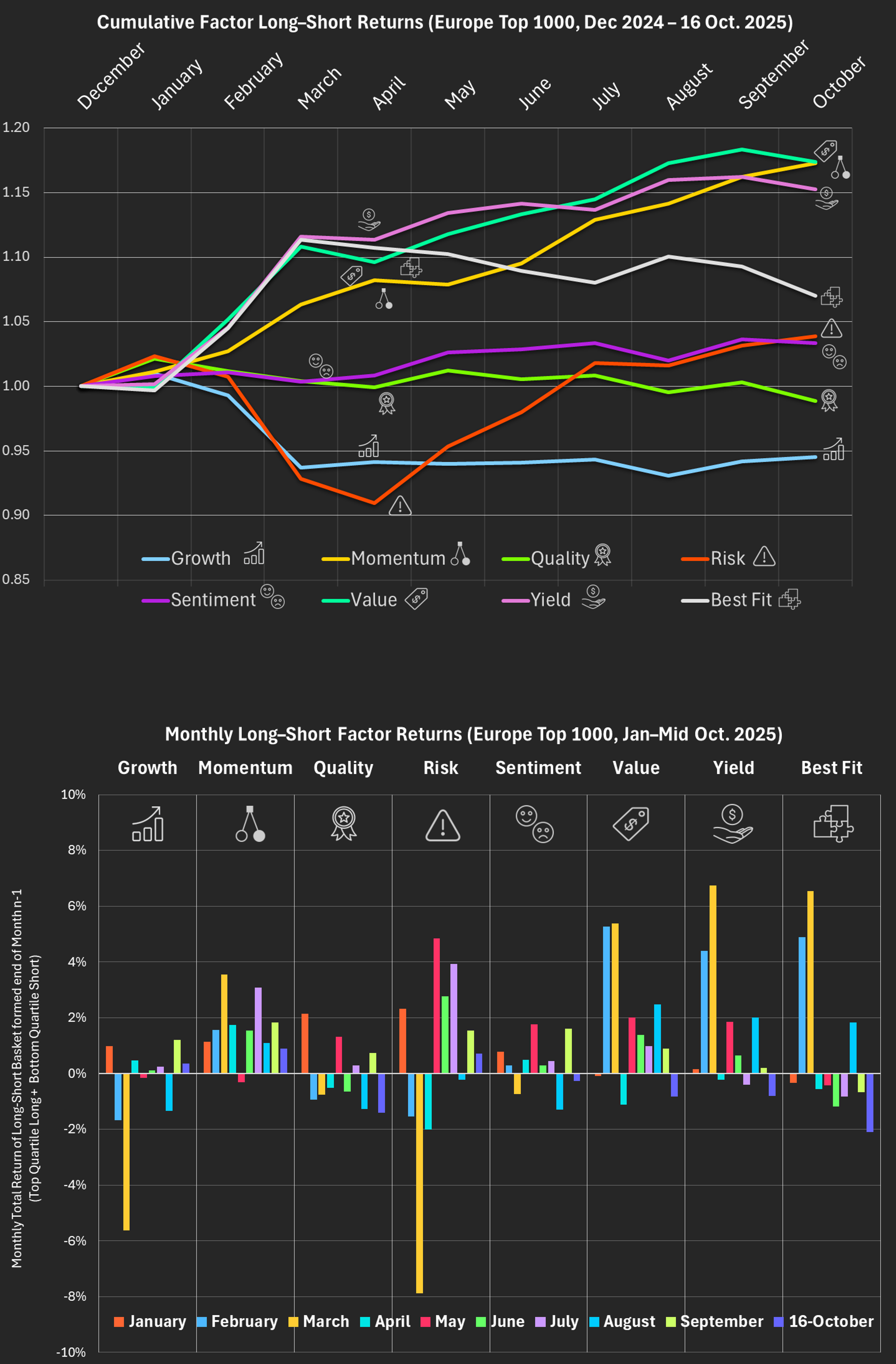
While U.S. equities remain captivated by the AI boom, Europe’s market has taken a different path.
Our factor data show that 2025 continues the rise of cyclicals - a broad leadership from Value, Momentum and Yield styles, far from the tech-led frenzy across the Atlantic.
Both markets have performed well - but for completely different reasons.
Key patterns (Jan – mid-Oct 2025)
Sector backdrop
The factor rotation mirrors Europe’s market leadership:
These sectors - not AI giants - drove the outperformance of Value and Momentum. Cyclicals such as financials, energy and industrials powered the rally, while defensive growth sectors like Consumer & Household Products lagged. Europe’s market strength came from broad sector dispersion - many industries advancing together - rather than from the concentration of a few mega-caps as in the U.S.
Academic context
Classic research (Asness, Moskowitz & Pedersen, Value and Momentum Everywhere, 2013) finds that Value and Momentum usually move in opposite directions, acting as natural diversifiers.
In 2025, however, European markets show both factors performing strongly at the same time - a rare alignment that typically emerges during phases of rising dispersion and macro reacceleration. This supports later findings (Ilmanen et al., 2019/2021) that factor behaviour is state-dependent, evolving with market and economic conditions.
Europe vs U.S.
In our U.S. study - US Equity Factor Rotations in 2025: Risk-Off, Rebound and Real Drivers - Growth and Quality remained concentrated in a few AI-linked mega-caps.
Europe, by contrast, has rotated toward cyclicals, financials, and industrials, with no major AI winners - yet both regions delivered strong returns.
The disconnect is stunning.
Method: Europe top 1000 stocks. Baskets formed of long top-quartile and short bottom-quartile per factor, rebalanced monthly, total return.
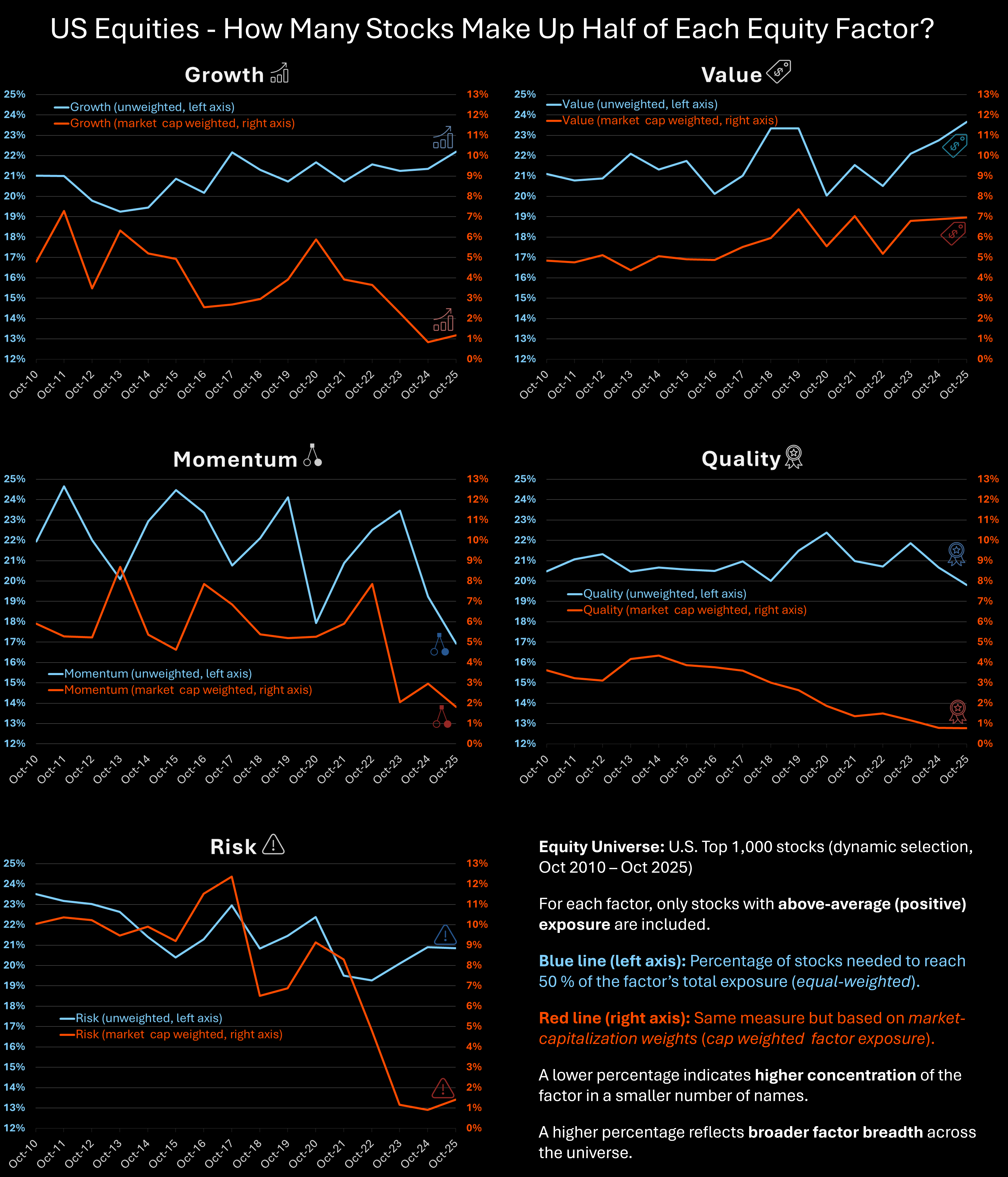
When the Mag7 Bend the Factor Space
The Magnificent 7 haven’t just reshaped U.S. indices - they’ve reshaped factors.
Using Sismo’s factor analytics on the largest 1 000 U.S. stocks (Oct 2010 – Oct2025), we examined five equity styles - Growth, Value, Momentum, Quality and Risk.
For each factor, we focused on stocks with above-average exposure and measured how many account for half of the factor’s total exposure once weighted by market capitalization.
Each chart shows this percentage over time:
Blue = unweighted (% of stocks)
Red = market-cap weighted (% of stocks)
What we found
In 2010, most factors were broad: 15 – 50 stocks were needed to reach 50 % of total exposure.
By 2025, four - Growth, Momentum, Quality and Risk - had become much narrower, dominated by the same mega-caps
The overlap is striking: the same small group sits at the intersection of multiple factors.
Their extraordinary rise has tilted the factor space itself, creating a multi-factor concentration unique in modern U.S. equity history.
Interpreting the picture
The blue lines have remained relatively stable.
This shows that factor structures themselves persist - there are still growth, value and quality stocks.
For stock selection, factor analysis remains a valid and powerful framework.
The red lines, however, reveal how market-cap dynamics - accelerated by the AI revolution - have concentrated the economic weight of several factors into a handful of names.
What changed is not the existence of factors, but their representation in today’s market.
Why it matters
Diversification across styles works only if their drivers remain distinct.
But when the same names dominate several factors, portfolio risk becomes less diversified than it appears.
A shock to a single company - say Nvidia - can ripple through Growth, Momentum, Quality and Risk exposures.
Research calls this factor crowding or narrow breadth:
The market still looks diversified.
The risk isn’t.
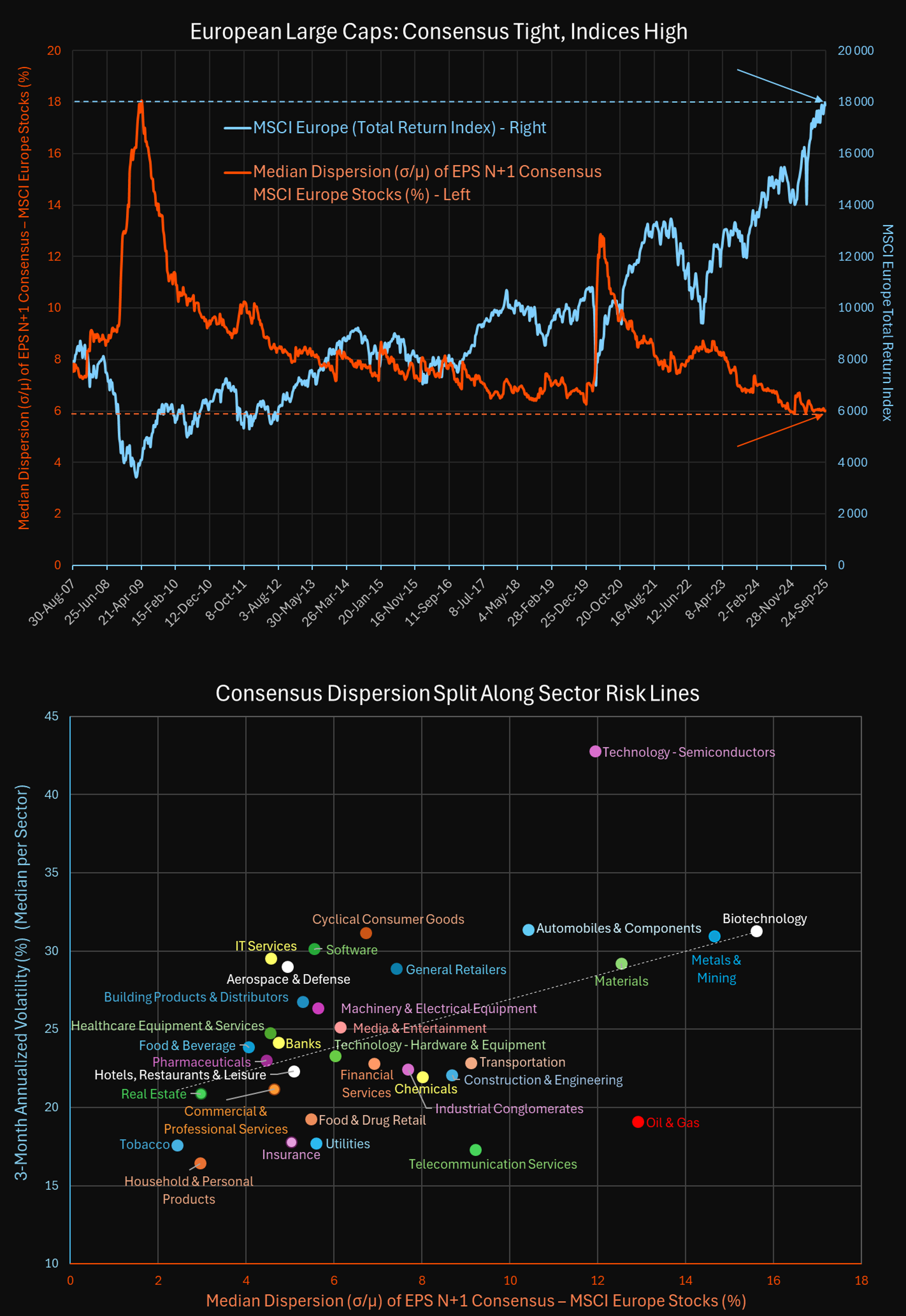
On European large caps (MSCI Europe), the median dispersion of broker forecasts on EPS N+1(σ/μ) has fallen to a record low of ~6%. At the same time, the index is at record highs.
Analysts have never agreed more on next year’s earnings, even while Europe faces:
How can forecasts look so “predictable” when the environment is so uncertain?
When low dispersion hides risk
In Hide in the Herd: Macroeconomic Uncertainty and Analyst Forecast Dispersion (Chen, Zhao & Zhou, 2025), the authors show that:
So tight consensus may reflect conformity, not clarity.
Academic view vs Sismo back-test
In other words: there is no contradiction - dispersion sorts appear to capture a blend of volatility and sector bias, with the relative advantage of high vs low dispersion depending on the market environment and risk appetite cycle.
Takeaway
Low dispersion today doesn’t mean next year’s earnings are genuinely predictable. It may simply mean analysts are reluctant to deviate.
For investors, the real signal lies in the cross-section: even when the overall median is tight, sector gaps in dispersion remain - and that’s where risks and opportunities arise.
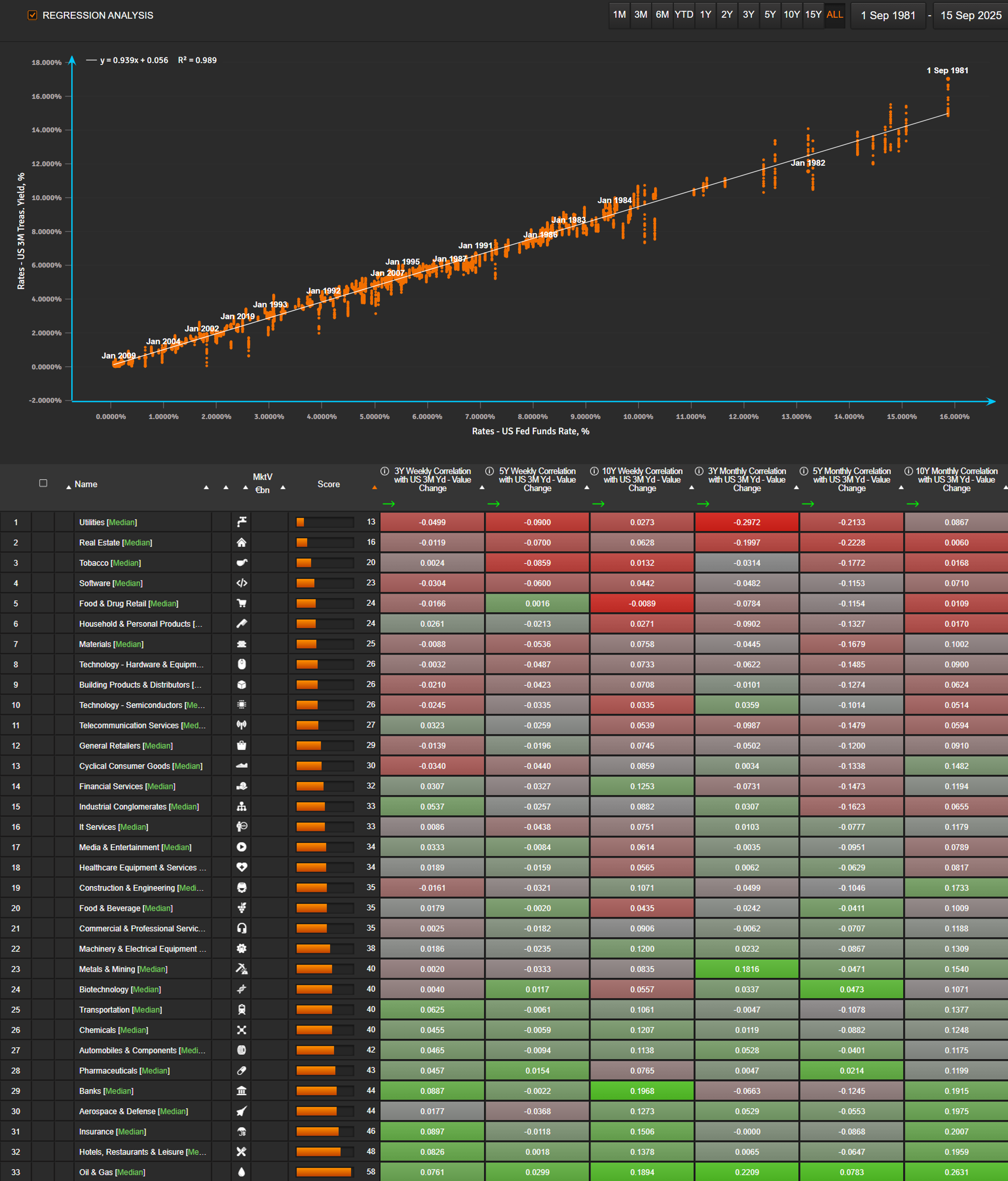
Tomorrow the Federal Reserve meets to decide on interest rates. Investors know the decision will ripple across markets - but how do we measure it?
Looking back more than 40 years, the Fed Funds rate has moved almost in lockstep with the 3-month Treasury yield (R² > 0.99). That makes the 3M yield the best proxy for Fed policy.
From there, the question becomes:
How do individual US stocks - and entire sectors - react when the 3M yield moves?
At Sismo, we measure weekly and monthly correlations of Russell 1000 stocks to changes in the 3M yield, across 3-, 5-, and 10-year windows. We then aggregate results at the sector level.
Here’s what the data shows today:
But the backdrop matters. With inflation risks still alive, the Fed faces a dilemma: ease too much and risk inflation, or stay tight and risk recession. If investors focus on that trade-off, they may be more reluctant to play the usual correlation trades.
The question for tomorrow:
Will markets follow the old playbook, or is a new regime taking shape?
Note: The sector view is insightful, but it can be taken further. On Sismo, the same analysis can be run at the individual stock level, then transformed into a custom factor to measure a portfolio’s holdings sensitivity to rate changes - all in just a few clicks.

Three charts sum up the story of US equity factors in 2025 (Sismo standard factors, US top 1000 stocks):
Cumulative factor returns
Risk and Growth started 2025 strong in January, then plunged in February–March before rebounding sharply in Q2. Value and Yield followed a similar path - both stronger in Q1 and weaker in spring - but Value staged a rebound in August, unlike Yield. Quality showed only modest positive and negative swings through the year and now ranks broadly in line with Value, reflecting a lackluster year for the factor. Momentum remained choppy, with a rally in July, while Sentiment stayed weak throughout.
Monthly factor returns
The bar chart shows the rotations clearly: risk-off in February–March, a powerful re-risking in Q2, and mixed leadership through the summer.
Tech EPS revisions vs Tech returns (US top 1000)
The third chart focuses only on technology stocks. Fed policy and yields were broadly stable in early 2025, yet Growth and Risk collapsed in Feb–Mar. The real drivers were:
The turning point came in May, when revisions flipped positive, fueled by AI adoption and stronger earnings guidance. From there, Growth and Risk surged back to lead year-to-date.
Why this matters for PMs
Factor leadership can flip in weeks. Macro alone doesn’t explain these rotations - fundamentals and revisions often do. Missing those inflection points means missing entire performance cycles.
That’s what Sismo delivers: connecting factors, fundamentals, and macro in real time, so you don’t just see performance - you understand the drivers.
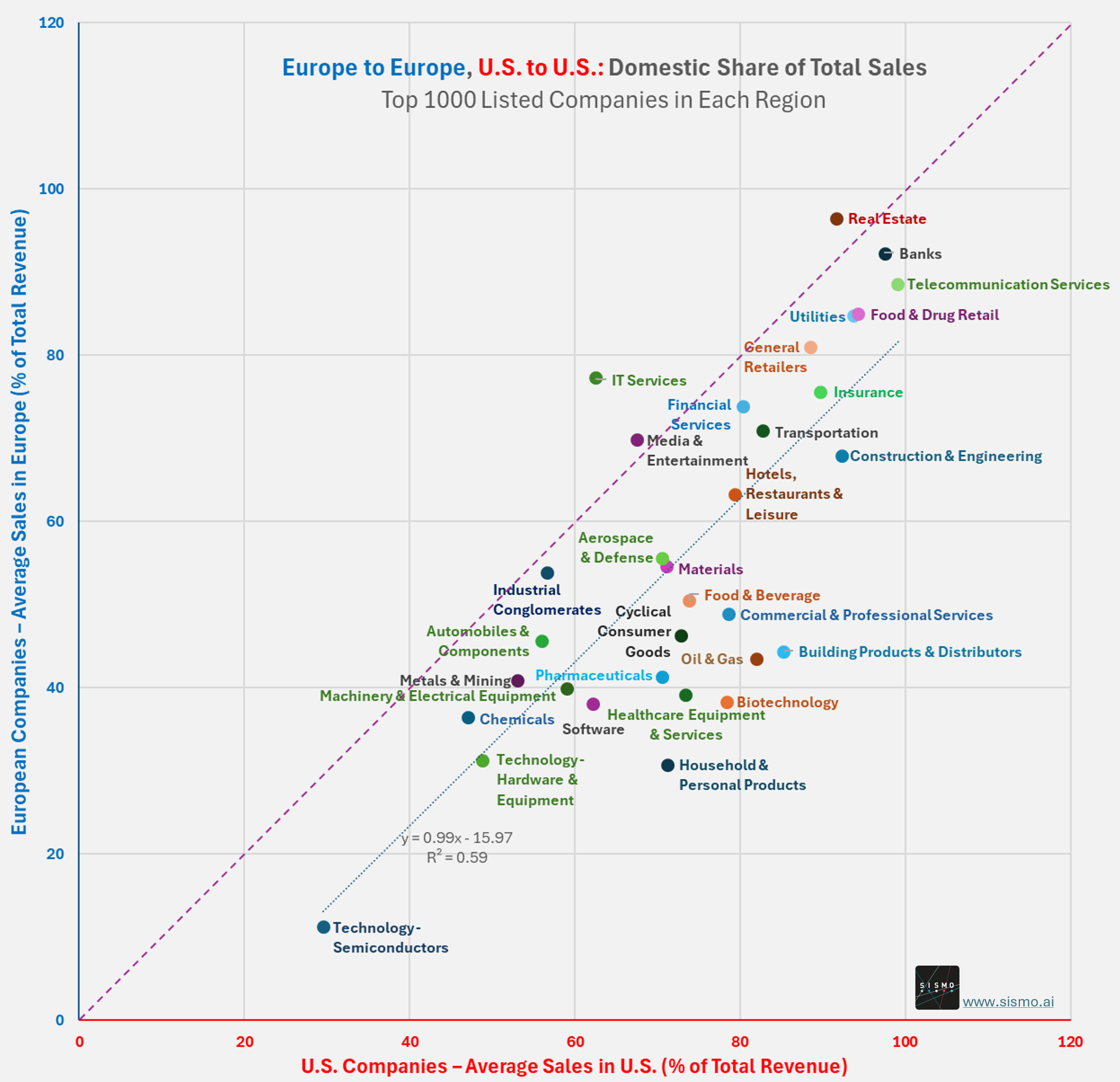
Earlier this week we showed how U.S. semiconductor companies rely heavily on Asia and China for sales. But that case is the exception rather than the rule.
With Sismo, we looked at the top 1000 listed companies in the U.S. and in Europe and measured the share of sales achieved in their home markets.
The results are striking. On average, U.S. large caps earned 75% of their revenues domestically in 2024 (median 82%). European large caps earned only 61% domestically (median 63%). Out of 32 sectors, 29 fall below the parity line, meaning U.S. companies achieve a higher share of local sales in almost every industry.
Some examples illustrate the scale of the gap: U.S. biotech companies earned 78% of sales at home versus 38% for European peers; U.S. oil and gas companies 82% versus 43% in Europe; and U.S. building products and distributors 85% versus 44% in Europe.
The exception remains semiconductors. Here, U.S. companies generate only 30% of their sales domestically and European peers just 11%, underlining Asia and China’s dominant role in this sector.
The conclusion for investors is clear. For U.S. large caps, the domestic market is the primary driver. Whatever happens globally often matters only to the extent it affects U.S. economics. For European large caps, international markets are indispensable. Growth depends on them.
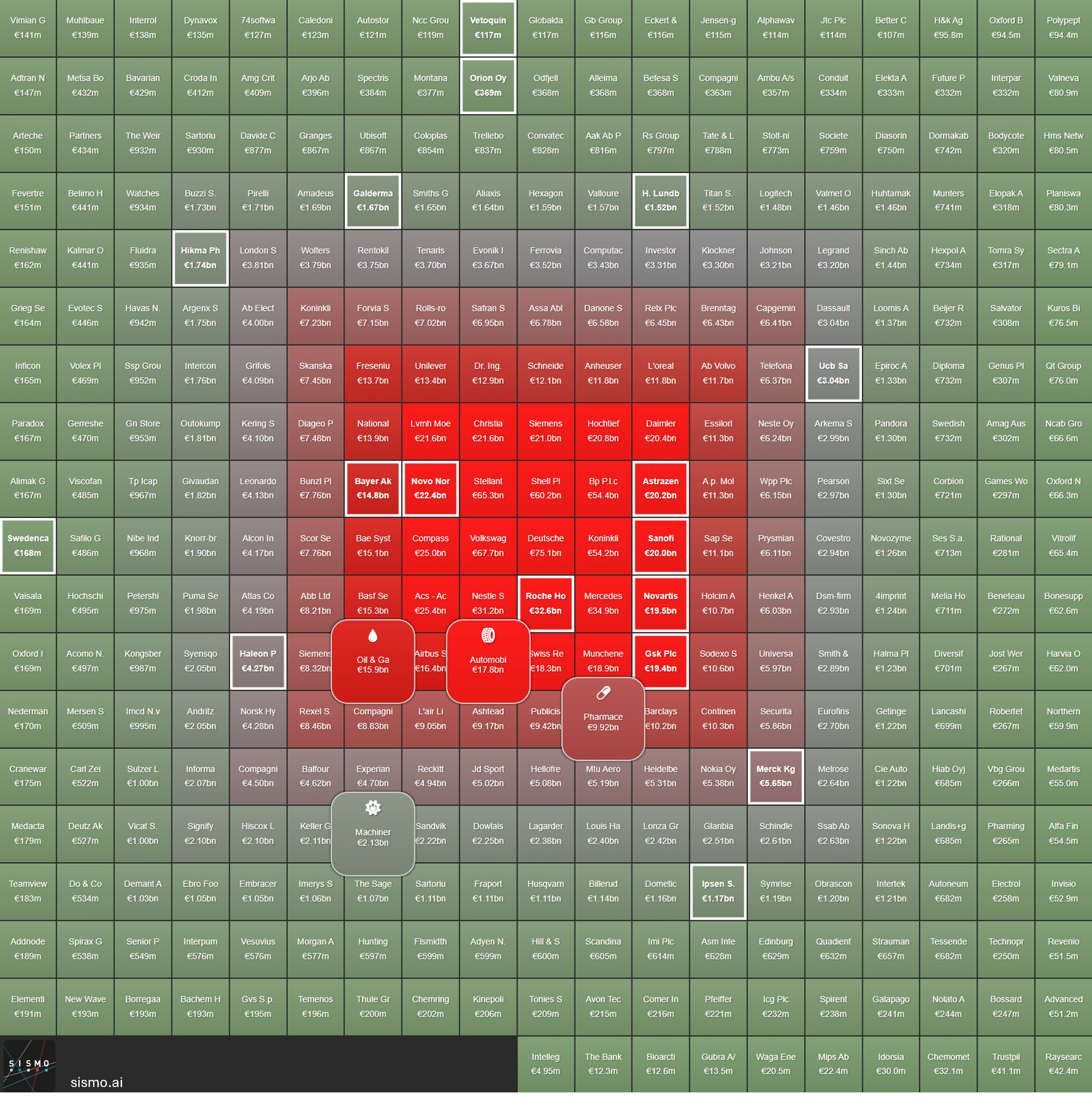
348 European companies earn more than 20% of their revenues from the U.S. & Canada. Together, they generated over €1.5 trillion in 2024 sales to North America.
These companies are part of a wider universe of 1,652 listed firms in Europe (with market cap > €0.5bn). Of those, 610 disclose sales to the U.S. & Canada - and the 348 above are the ones with true dependency.
Who drives this?
At the very center: Roche, Novo Nordisk, AstraZeneca, Sanofi, Novartis.
About the chart
This heatmap shows the 348 European companies with more than 20% of sales to the U.S. & Canada
Europe is tied to the U.S. for €1.5 trillion in sales. In your portfolio, is that a strength - or a risk you need to hedge?

In mid-August, President Donald Trump broke with decades of U.S. national security policy when he struck a deal with Nvidia to allow advanced AI chip exports to China in exchange for giving the U.S. government a cut of its sales. A similar arrangement with AMD soon followed.
Traditionally, export controls on sensitive technologies were absolute: once restricted, companies couldn’t “buy their wayout” of the ban. This new approach introduces a different kind of corporate risk.
How dependent is the U.S. semiconductor industry on Asia?
Using Sismo’s global equity dataset, we looked at the top 2,000 U.S.-listed companies. Among them, 496 disclose how much of their revenue comes from Asia-Pacific. For these 496 stocks, the heatmap shows:
· Position from periphery to center (and green to red color gradient) based on their share of sales in Asia-Pacific last year
· Rounded tiles showing industry medians
· Semiconductor stocks framed in white
What emerges is striking:
· 51 publicly listed U.S. semiconductor companies appear, clustered near the center as the most Asia-exposed U.S. stocks
· Their average Asia-Pacific exposure is 62% (median 65%)
· For China specifically (data available for 38 firms), the average exposure is 30% (median 25%)
The takeaway: Asia, and China in particular, are the growth engines of the U.S. semiconductor industry. These sales not only drive U.S. companies’ revenues but also risk accelerating China’s technological capabilities. Whether diverting “15% of Nvidia’s sales” of advanced chips to China is a step toward industrial policy - or a detour away from it - is an open question for U.S. strategy.
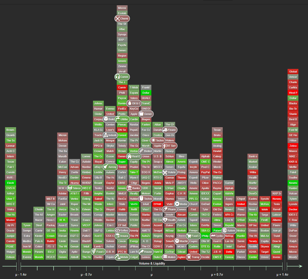
Over the past month, we’ve observed a striking asymmetry in S&P 500 trading behavior:
• Stocks that underperformed experienced massive turnover and volume surges
• Defensive and resilient names traded in relative silence
This is not broad-based rotation – it’s selective repositioning.
The most heavily traded stocks over the past month tend to be those most exposed to tariff risk and recent macro headlines.
Meanwhile, many of the best-performing names have shown little increase in trading activity.
What we measured:
• % change in cumulative trading volume over the last month (since Trump’s “liberation day”) vs. one month of volume from three months ago, displayed left to right on the horizontal axis.
• 3-month total return centered on the S&P 500 average, shown by color, from red (underperformance) to green (outperformance).
The red and green tiles in the chart represent this relationship clearly: as a general pattern, volume surged where performance was weakest.
Example: Nike
-25% total return over 3 months
+141% increase in trading volume in the last month compared to 3 months ago
Nike is just one of many high-profile names experiencing this dynamic, particularly among global importers and consumer brands sensitive to tariffs.
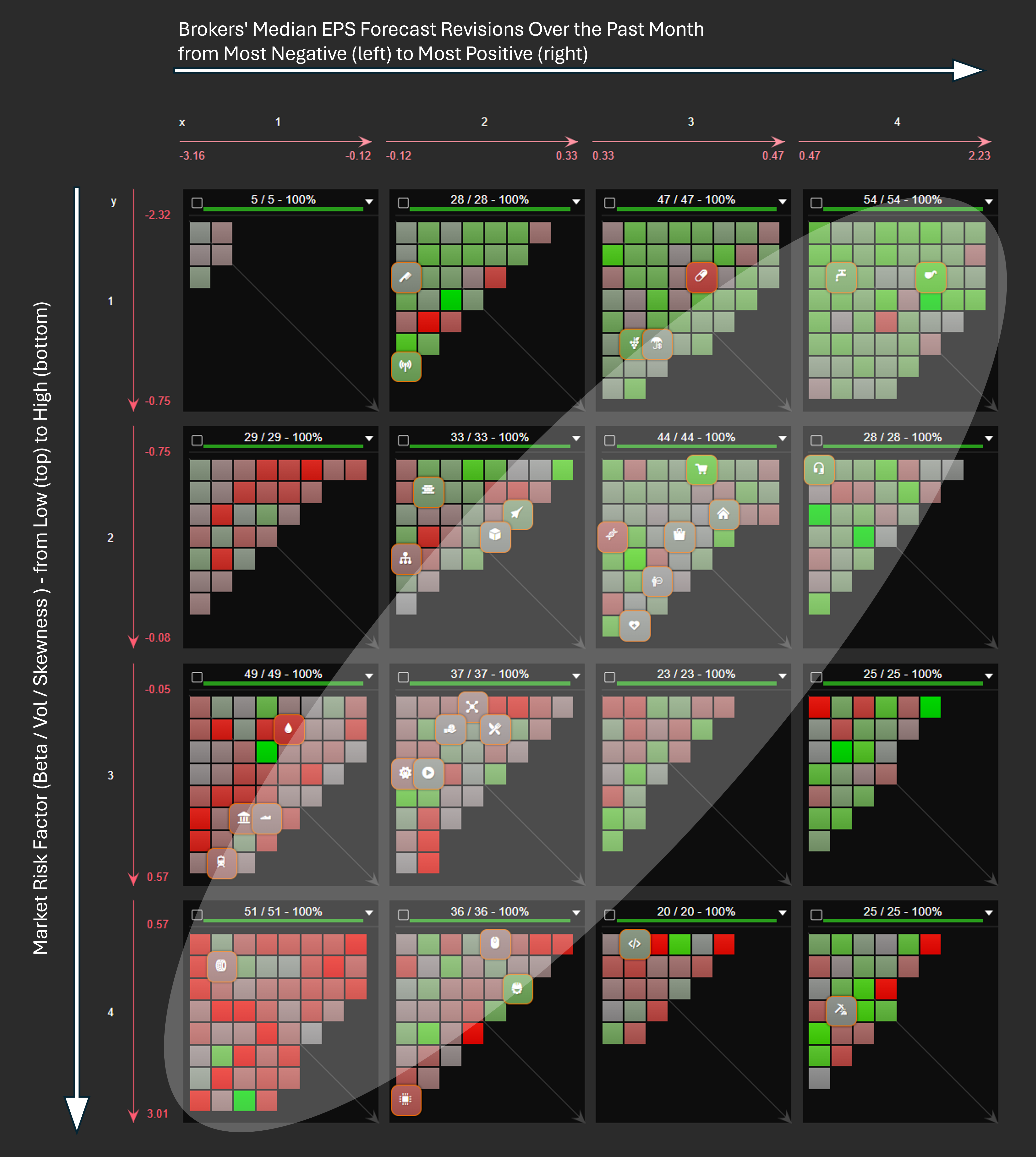
Is the market still rational in turbulent times? Earnings revisions over the past months suggest it is – and strongly.
As the market noise starts to settle, analysts have been revising their earnings expectations for S&P 500 companies - and the shifts over the past months reveal a classic pattern.
🔹 Defensive sectors like Utilities, Food &Drug Retail, and Commercial Services are holding steady.
🔻 Banks, Autos, and Semiconductors are facing sharp downward revisions.
In the visual below:
• Companies are ordered from let to right based on the magnitude of earnings revisions over the past month (from negative to positive),
• From top to bottom by market risk low to high, based on beta, volatility, and skewness,
• Colored from red to green according to their relative performance against the S&P 500 over the same period.
Despite waves of conflicting economic and geopolitical headlines, markets are reacting in a very textbook way - favoring low-risk, defensive stocks during periods of uncertainty.
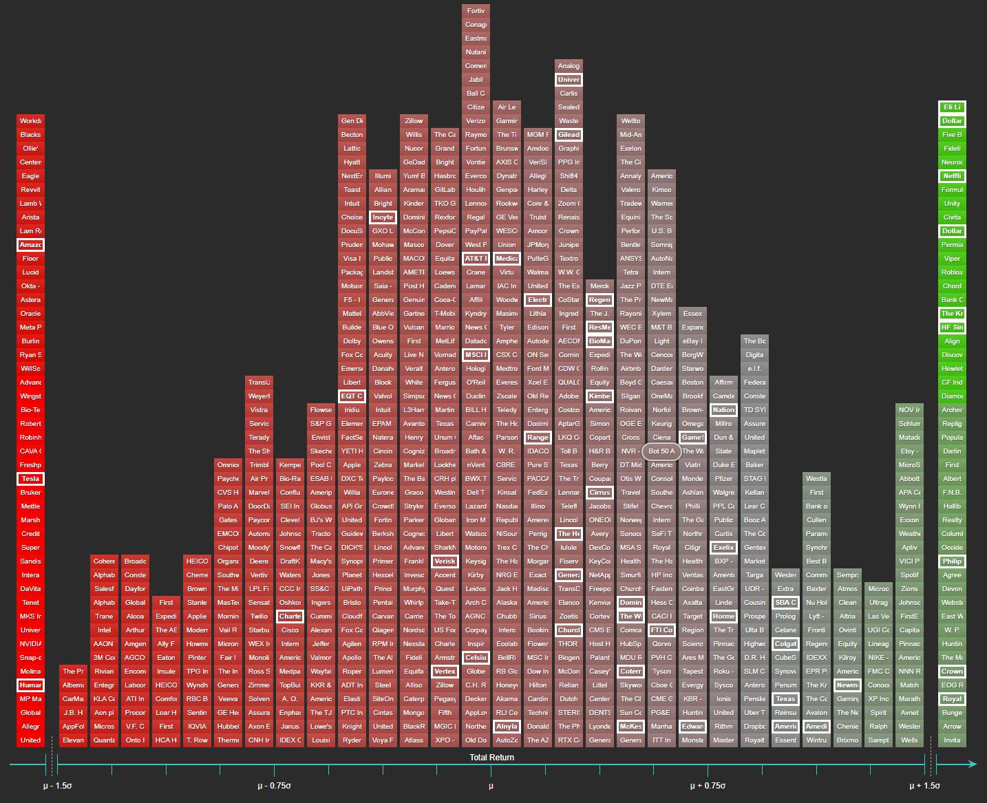
Preliminary April data shows the sharpest quarterly drop in the University of Michigan Consumer Sentiment Index since May 2020.
Using Sismo, a 15-year quarterly analysis of Russell 1000 stocks was run to identify the 50 names least correlated with changes in consumer confidence - those that historically show low or even negative sensitivity to sentiment shifts.
These stocks were then mapped onto the chart below:
What you’re seeing:
What stands out:
76% of these confidence-resilient stocks outperformed the index average last week. Names like Netflix, Dollar General, and Kroger appear clearly on the right - showing that not all stocks fall with sentiment.
This is the type of macro-aware, data-structured signal Sismo helps surface in seconds - and it’s built for fundamental investors.
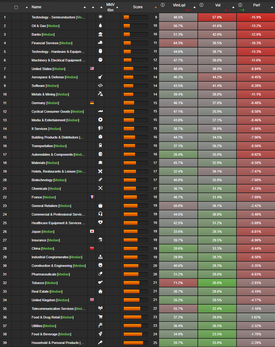
When everything seems to be falling at once, identifying what’s truly under pressure - and what still appears to hold some ground - can be informative.
Let’s have a look at what happened last week across global equities. Using Sismo’s analysis of MSCI World large caps, we focused on three indicators:
We grouped stocks by sector (33 categories) and by country (France, Germany, UK, US, Japan, China), analyzing median values.
Overall results across the universe:
By sector: The surge in trading activity wasn't random. It concentrated in sectors either under significant pressure:
Or heavily traded due to renewed attention:
By country:
We then combined the three metrics into a composite stress score (out of 30), where a lower score indicates higher market stress - driven by a mix of heavy trading, high volatility and weak returns.
Most stressed sectors:
Most resilient sectors:
Country-level scores (lower = more stress):
United States (14), Germany (15), France (18), Japan (19), China (19), UK (20)
We often assume investors have become more sophisticated - armed with multi-factor models, real-time data and AI-powered tools. But when markets face hard-to-digest shocks (like a potential surge in tariffs), the flight to low beta is alive and well.
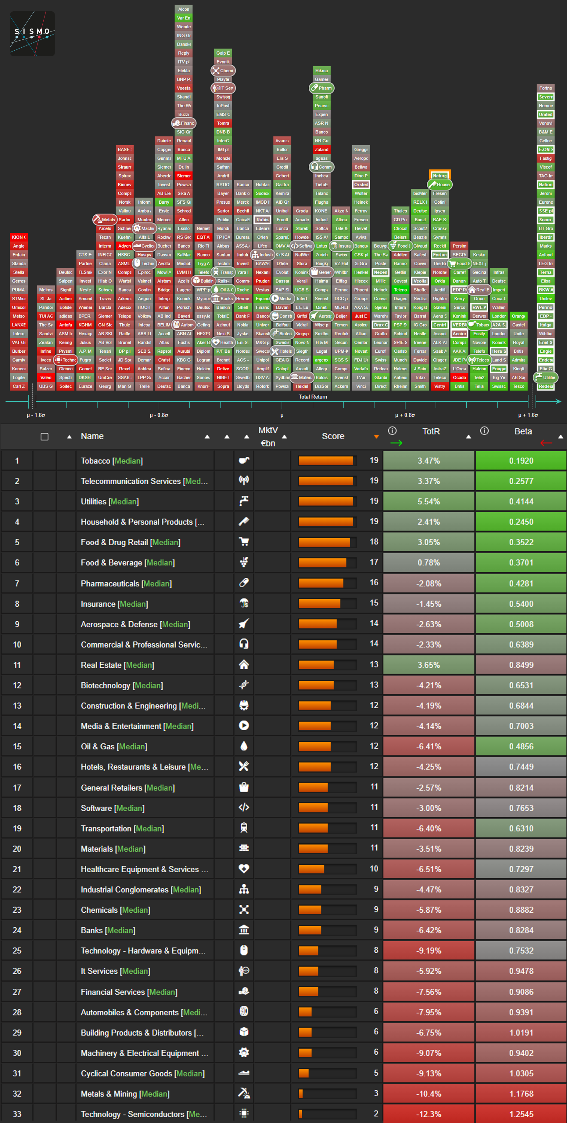
In the Sismo visual below, we show the distribution of 1-week total returns for the Stoxx Europe 600 stocks. The tails have been trimmed at 1.6 standard deviations from the average to improve readability. Rounded tiles represent sector medians, while the color gradient maps each stock's 2-year daily beta versus MSCI Europe - from green (low beta) to red (high beta). Utilities are framed in white.
The pattern is striking: a strong inverse correlation between color (beta) and position (return). Utilities are clustered in the right-hand tail, dominating the outperformance - yet again illustrating how low-beta stocks tend to shine when uncertainty hits.
A second visual presents a table summarizing the median 1-week total return and median 2-year daily beta for 33 industries. We also show a score, which combines each industry’s median decile position across both axes. All data as of market close on April 3, 2025.
This brings us back to the origins of beta - first formalized in the 1960s with the Capital Asset Pricing Model (CAPM). Designed as a tool to explain returns in a rational market, beta may have become something else: a powerful behavioral signal.
Investors still run for shelter when clouds gather - and beta continues to guide their flight path. Is this risk-aware positioning, or just modern crowd behavior?
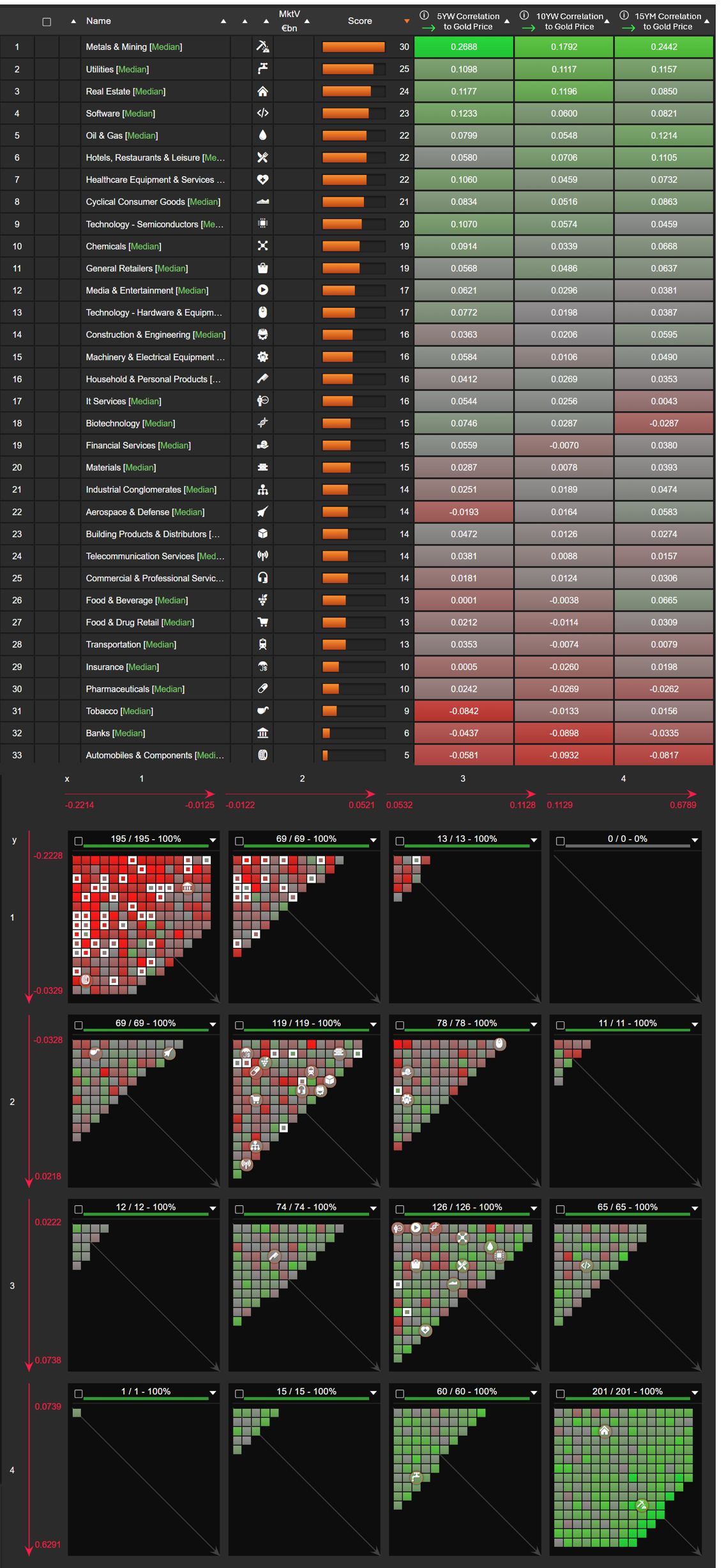
We continue our correlation journey on macro data with Sismo Analytics, analyzing gold’s latest rally.
While gold is often seen as an inflation hedge and safe-haven asset, its relationship with equity sectors is more nuanced than a simple "risk-off" trade. Which sectors move in sync with gold - and which go the other way?
Sectors Most Positively Correlated With Gold:
Metals & Mining - No surprise here; gold miners thrive as prices rise.
Utilities - Defensive? Inflation hedge? Sismo reveals a strong link, possibly due to their bond-like characteristics in a low-rate environment.
Real-Estate - Another real asset that responds to inflation and falling rates, often moving in tandem with gold.
Software - A surprising result. This may indicate a flight to quality within tech, where cash-flow-rich firms behave defensively.
Sectors Least (Negatively) Correlated With Gold:
Automobiles - Rising gold often signals macro uncertainty, which does not favor consumer-driven sectors like auto.
Banks - A classic inverse relationship: higher gold often means lower rates, which pressure banks’ margins.
What This Means for Investors
Gold isn’t just a hedge against uncertainty - it has real, measurable connections with equity sectors. Sismo helps uncover these relationships in real-time, giving investors a macro-driven edge in portfolio positioning.
How We Measure This in Sismo
Our analysis covers MSCI World ETF constituents, showing correlation to %change in gold price over:
- 5Y weekly (from left to right)
- 10Y weekly (from top to bottom)
- 15Y monthly (from red to green)
We visualize this in 3D, with banks framed in white to highlight their distinct behavior. The table view ranks sectors based on their median decile positioning, offering a clear and intuitive scoring system for investors.
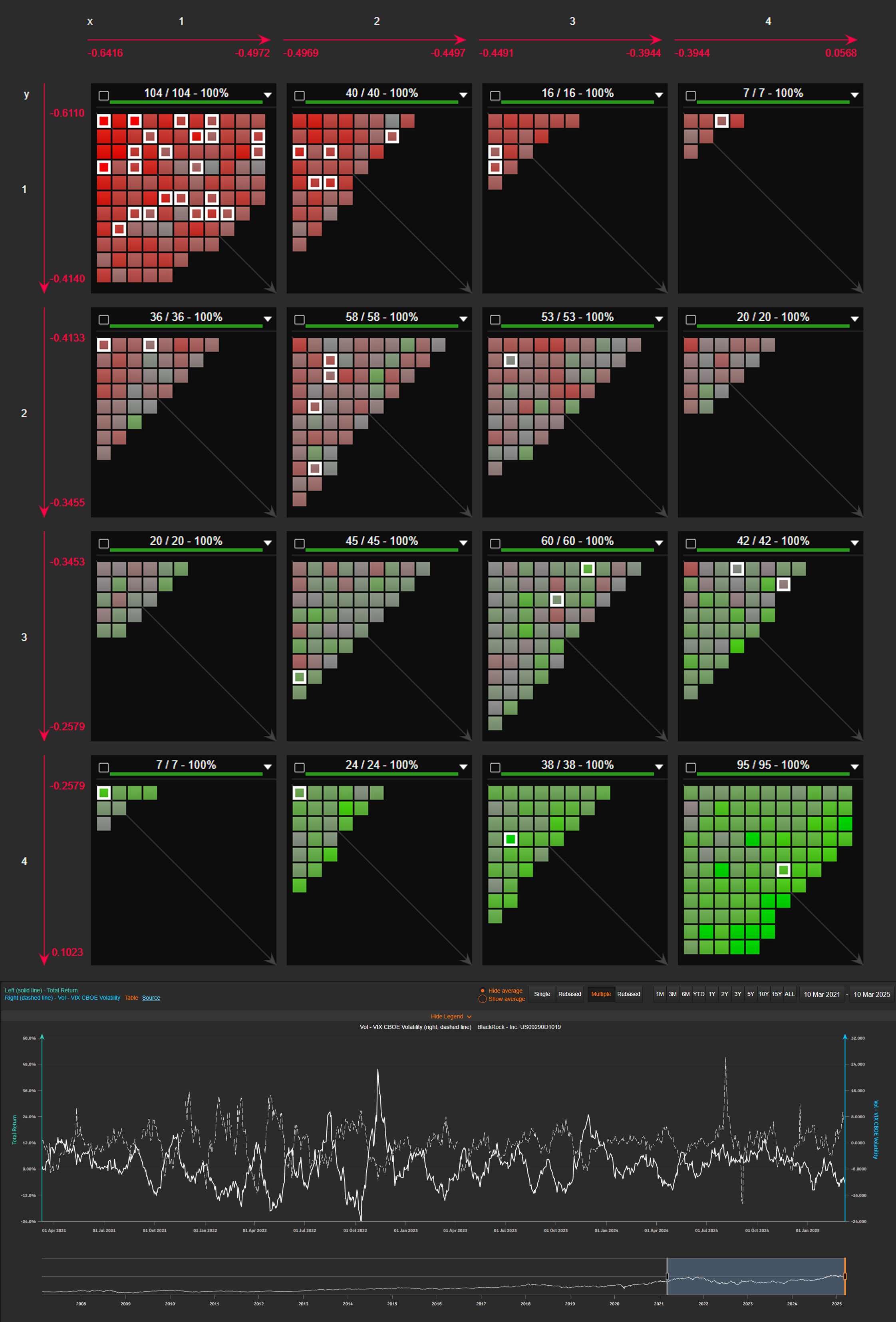
With geopolitical uncertainties, economic slowdown fears and inflation concerns mounting, volatility is back in focus. The VIX reflects volatility expectations based on option pricing and typically rises when equities decline, but individual stocks don’t respond in the same way.
Mapping VIX correlation across the Russell 1000:
Our 3D analysis highlights how different stocks react to volatility shocks:
- Left to right: 5Y weekly correlation with VIX changes
- Top to bottom: 10Y monthly correlation
- Color scale (red to green): 15Y monthly correlation
Key takeaway: Financial services stocks (framed in white) cluster in the top-left reddish corner, showing a strong negative correlation with VIX.
At a stock level, rolling 1M total return vs. 1M VIX change provides another lens. For instance, BlackRock’s data over the past four years makes the negative correlation easy to confirm.
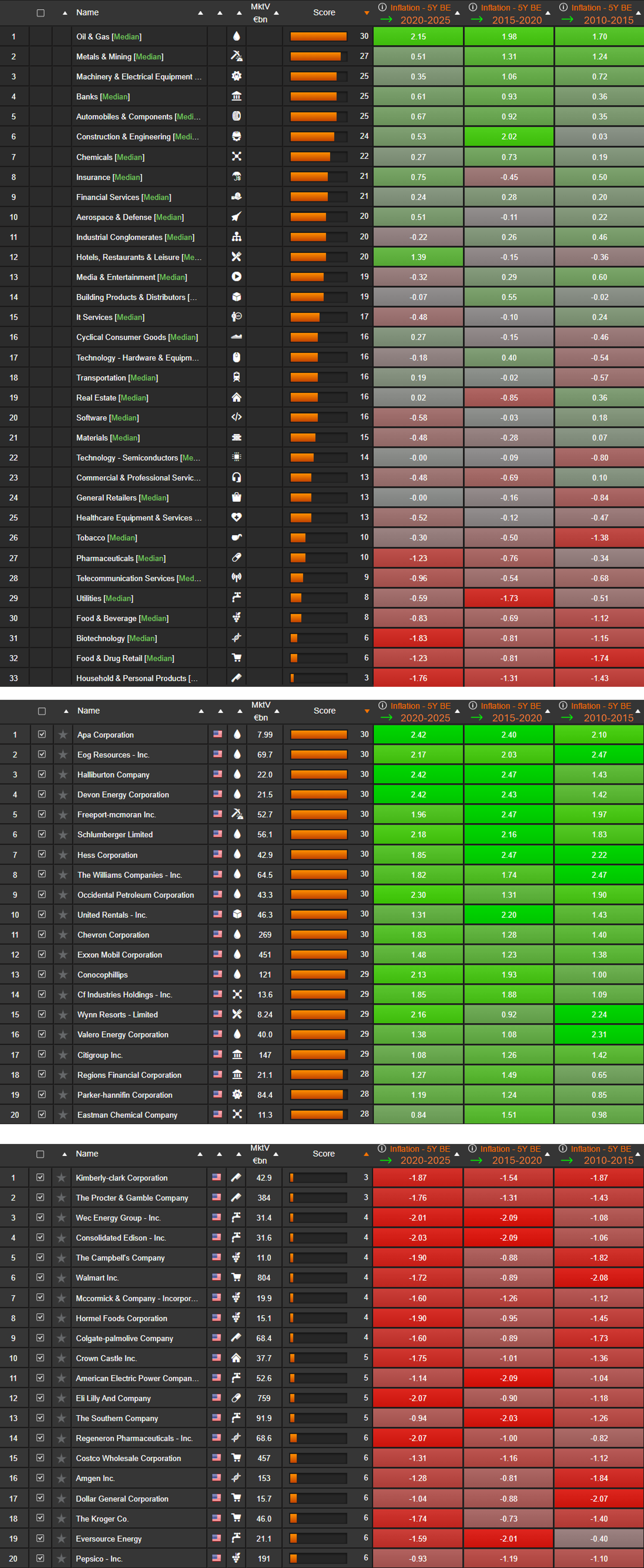
US inflation unexpectedly rose to 3% in January, challenging the perception that inflation was under control after a prolonged period of high interest rates. Recent data from both the US and Europe suggest inflationary pressures remain persistent, pushing rate expectations higher.
While the stock market generally reacts negatively to sustained high rates, not all stocks are equally affected. Some sectors and companies have historically performed better in inflationary environments.
Inflation Sensitivity Across S&P 500 Stocks
The visual shows how S&P 500 stocks have historically responded to inflation. It includes:
Based on 15 years of data, the sectors that tend to benefit from inflation include:
- Oil & Gas
- Metals & Mining
- Machinery & Electrical Equipment
On the other hand, sectors that struggle the most include:
- Household & Personal Products
- Food & Drug Retail
- Food & Beverage
- Utilities
At the stock level, Halliburton and EOG Resources have historically gained in inflationary periods, while Kimberly-Clark and Procter & Gamble have been among the hardest hit.
Methodology
We calculate an inflation impact factor using:
· 5-year weekly correlation to the 5-year Breakeven US T-Bond
· Beta to the 5-year Breakeven US T-Bond in a 2-factor regression (5Y Breakeven + S&P 500)
The factor is computed over three periods (2020–2025, 2015–2020, 2010–2015). Stock scores represent the sum of their decile positions across these periods, and sector impact is based on the median score of constituent stocks.
In January 2025, the first month of the new U.S. administration brought a wave of policy announcements — and markets reacted. Using Sismo, we analyzed Russell 1000 stocks as of 31 January 2025, ranking them on three key metrics:
The overall market gained +3.8% on average, but sector performance varied sharply:
This analysis demonstrates how Sismo helps investment teams understand the interaction between policy shifts, sector trends, and factor exposures. By combining macro-sensitive factors with sentiment and performance data, Sismo provides the clarity needed to adjust portfolios quickly.
In collaboration with InFi Strategies, LLC, Sismo analyzed stock market reactions to the last four U.S. elections - those electing Barack Obama (2008, 2012), Donald Trump (2016), and Joe Biden (2020). The report examines sector moves, volatility trends, and resilience during crises.
Highlights:
Read the full paper by Jodie M. Gunzberg, CFA and Emmanuel Dayan: Download here
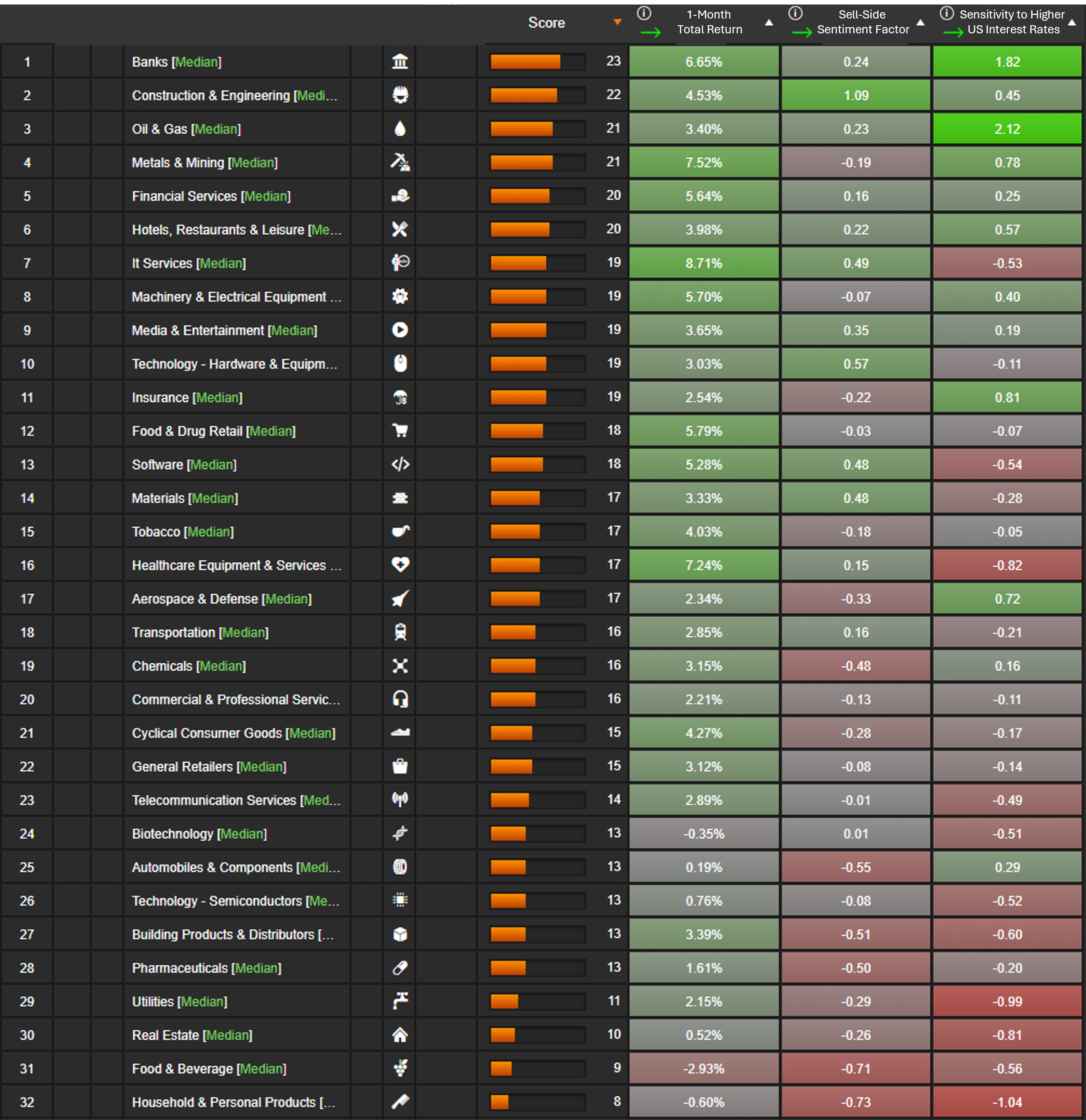
As the U.S. Federal Reserve signaled its intention to begin cutting interest rates, Sismo and InFi Strategies analyzed the Russell 1000 to identify sectors and stocks most likely to benefit or struggle in a falling-rate environment. Using Sismo’s visual analytics, the study examined 10-year returns, correlations, and multi-factor regressions against U.S. 10-Year Treasury yields.
Highlights:
Why It Matters:
Understanding sector-specific sensitivity to interest rates helps investors position portfolios ahead of monetary policy shifts. The analysis provides a roadmap for both defensive positioning when rates fall and growth capture when rates rise.
Read the full report by Jodie M. Gunzberg, CFA, and Emmanuel Dayan: View PDF
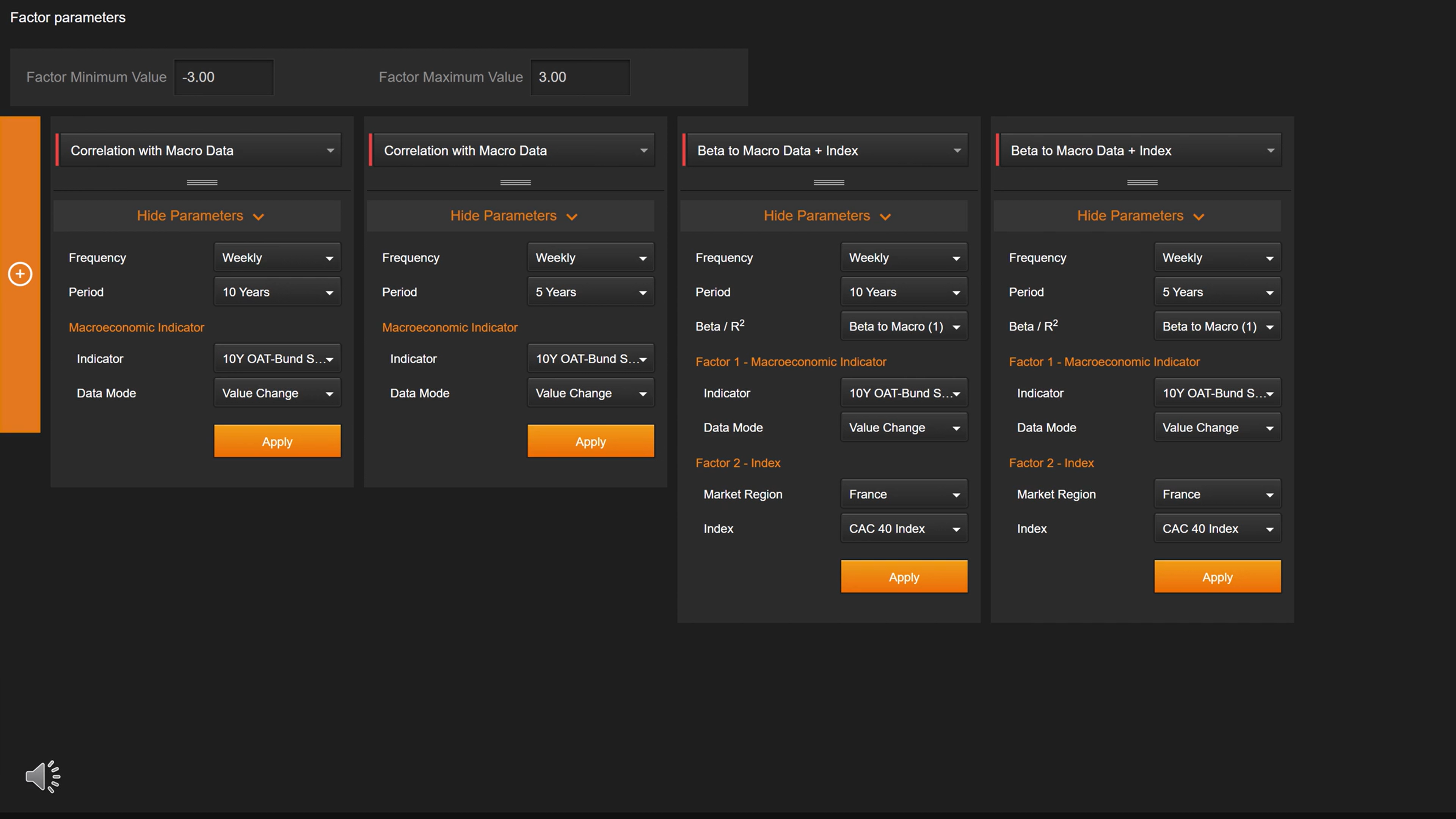
Following the surprise announcement of France’s snap elections, Sismo analyzed the correlation and beta of French stocks relative to the spread between the volatile French OAT and the German 10-year Bund. This revealed how political uncertainty and widening sovereign spreads connect to individual stock movements, giving portfolio managers a risk-aware view of market reactions.
Highlights:
Why It Matters:
Political shocks can trigger sudden spread movements that ripple through equity markets. By quantifying correlations and betas to sovereign spreads, investors can anticipate potential drawdowns, rebalance sector exposures, and mitigate political risk in equity portfolios.
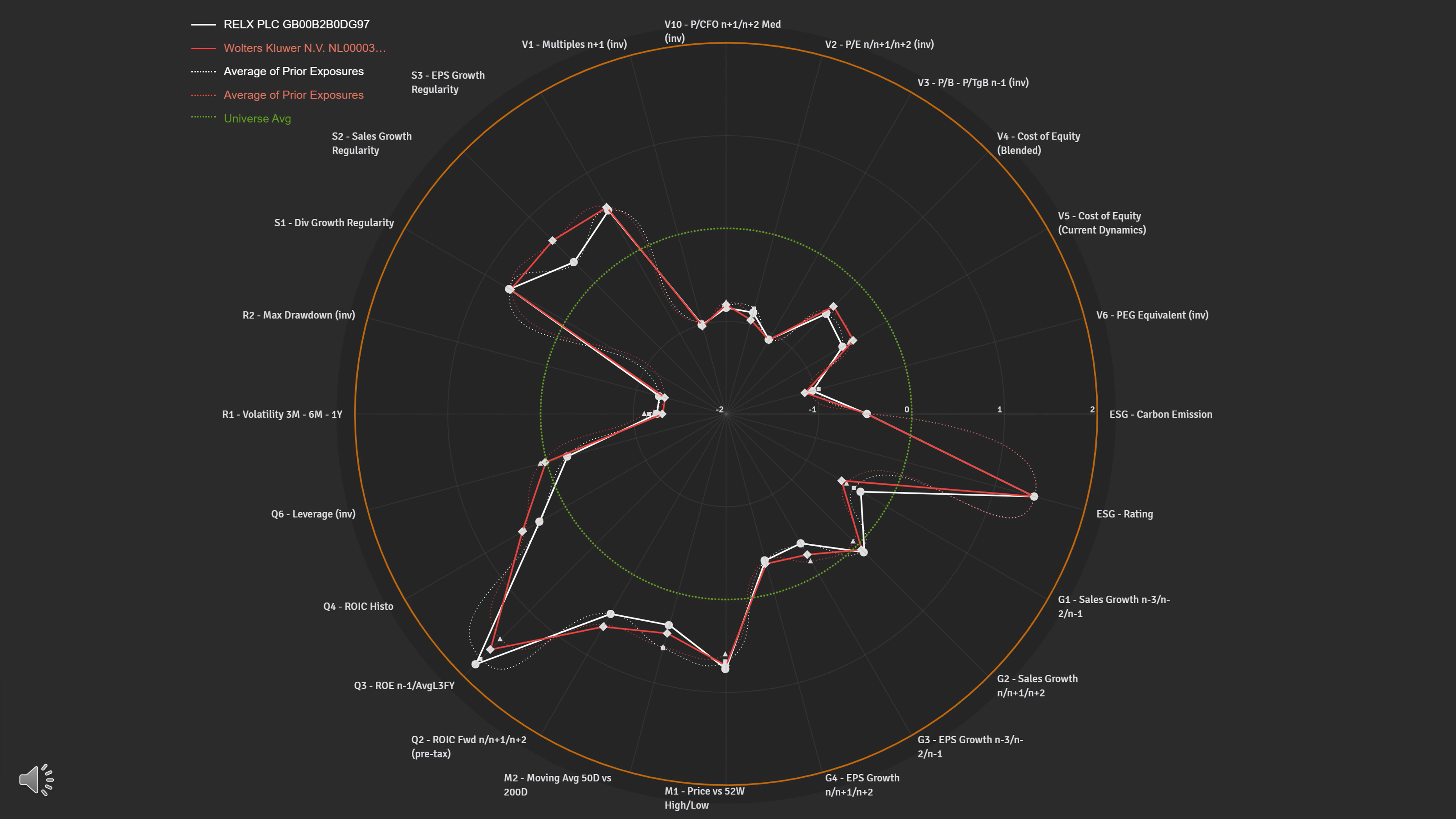
In asset management and corporate finance, finding stocks that closely correlate with a target stock — or that share similar profiles across multiple metrics — is a cornerstone of portfolio construction and benchmarking. Sismo streamlines this classic task, enabling multi-metric peer discovery, back-testing, and factor analysis in just a few clicks.
Highlights:
Why It Matters:
Peer analysis helps investors spot opportunities, manage sector and factor exposure, and build more resilient portfolios. Sismo makes this process faster, more data-rich, and more intuitive than traditional spreadsheet workflows.
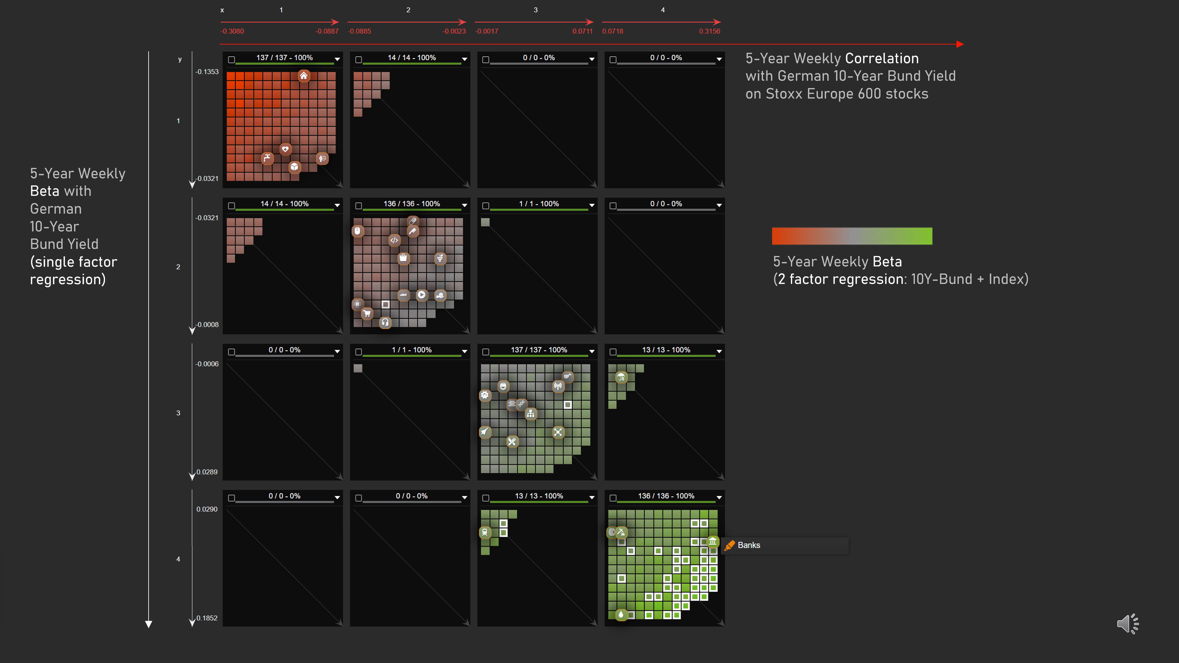
Sismo’s new macro impact feature enables asset managers to quantify how a macroeconomic series influences stock performance - instantly and with consistent accuracy over time. This tool works with any macro series and any stock universe, revealing both the strength and stability of the relationship.
Using the German 10-year Bund yield as an example, the analysis shows how shifts in sovereign yields have historically influenced European equity performance, and how that relationship has evolved over different periods.
Highlights:
Why It Matters:
Macroeconomic shifts can reshape sector performance and risk exposure. By quantifying these relationships historically, investors can better position portfolios ahead of expected macro moves
Whether you're refining a portfolio, tracking risk, or preparing for investor meetings — Sismo gives you the clarity to go faster and stay aligned with your strategy.