With geopolitical uncertainties, economic slowdown fears and inflation concerns mounting, volatility is back in focus. The VIX reflects volatility expectations based on option pricing and typically rises when equities decline, but individual stocks don’t respond in the same way.
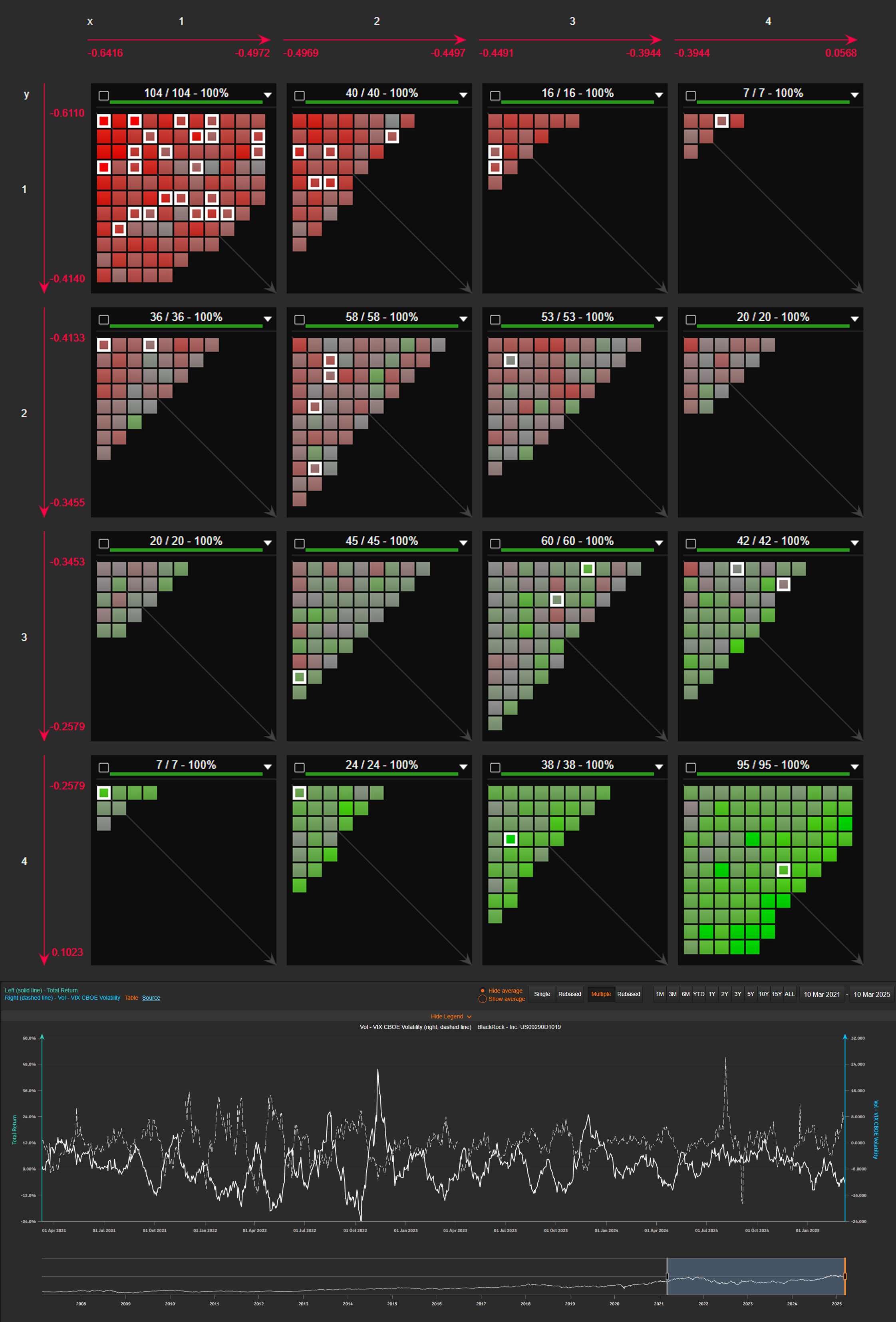
Mapping VIX correlation across the Russell 1000:
Our 3D analysis highlights how different stocks react to volatility shocks:
- Left to right: 5Y weekly correlation with VIX changes
- Top to bottom: 10Y monthly correlation
- Color scale (red to green): 15Y monthly correlation
Key takeaway: Financial services stocks (framed in white) cluster in the top-left reddish corner, showing a strong negative correlation with VIX.
At a stock level, rolling 1M total return vs. 1M VIX change provides another lens. For instance, BlackRock’s data over the past four years makes the negative correlation easy to confirm.